
Start With One Strong Focal Point
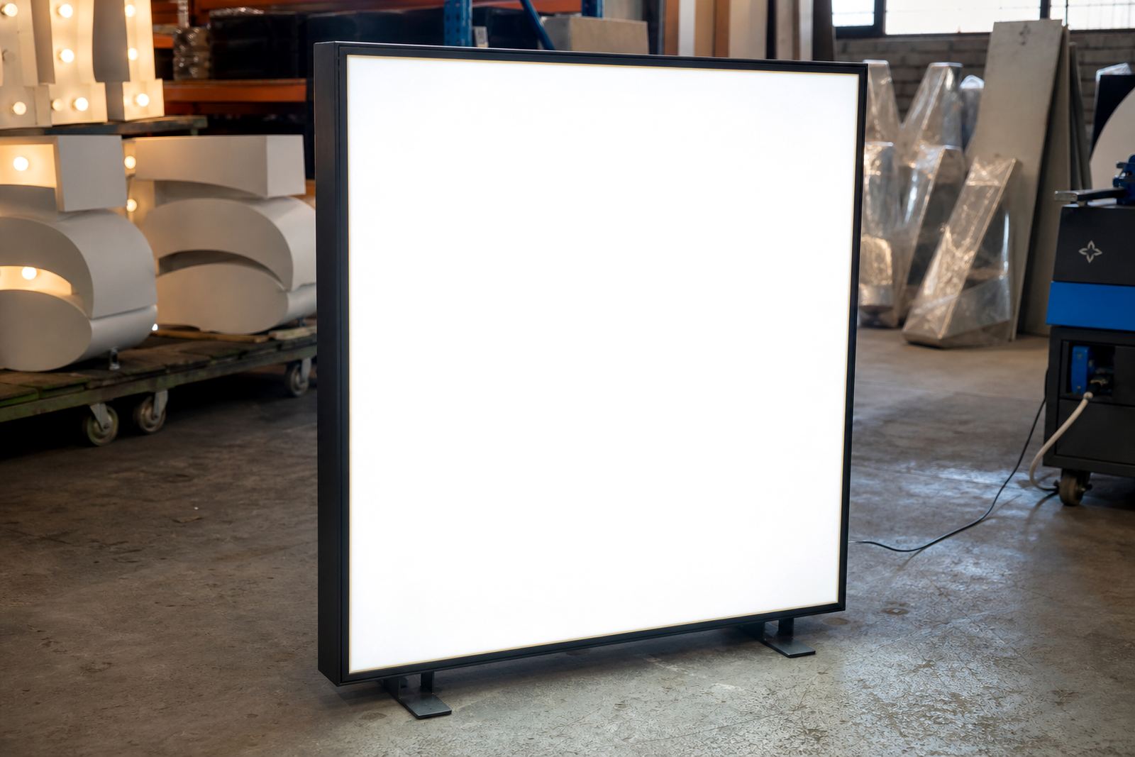
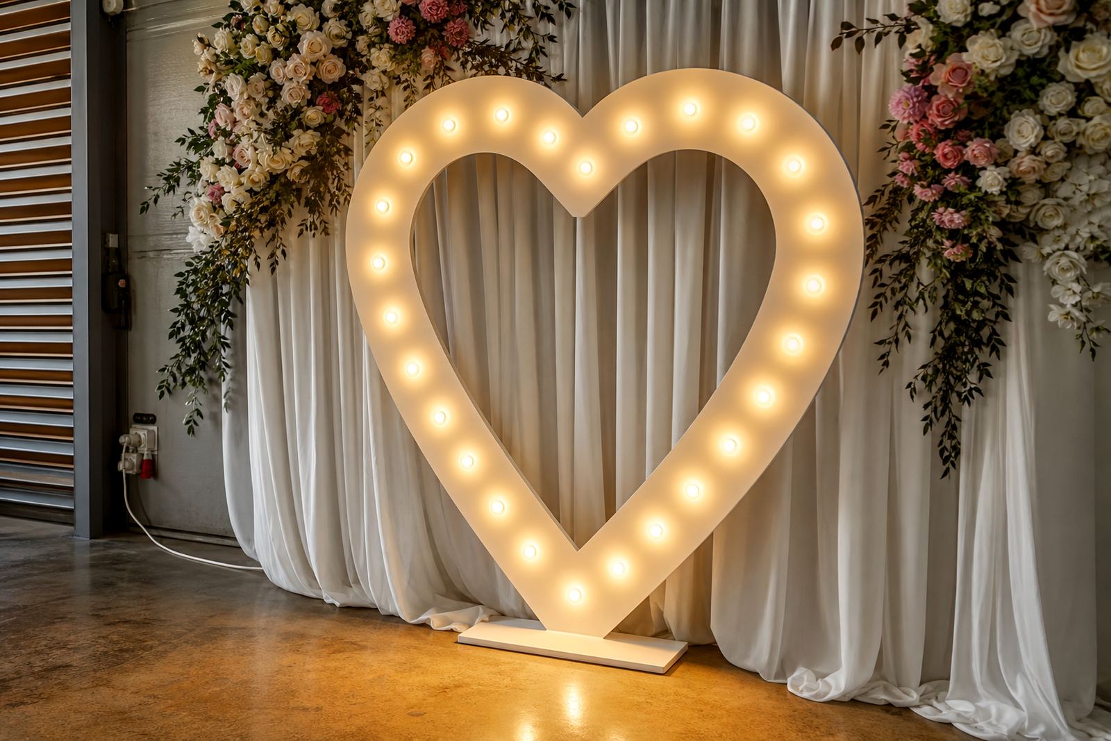
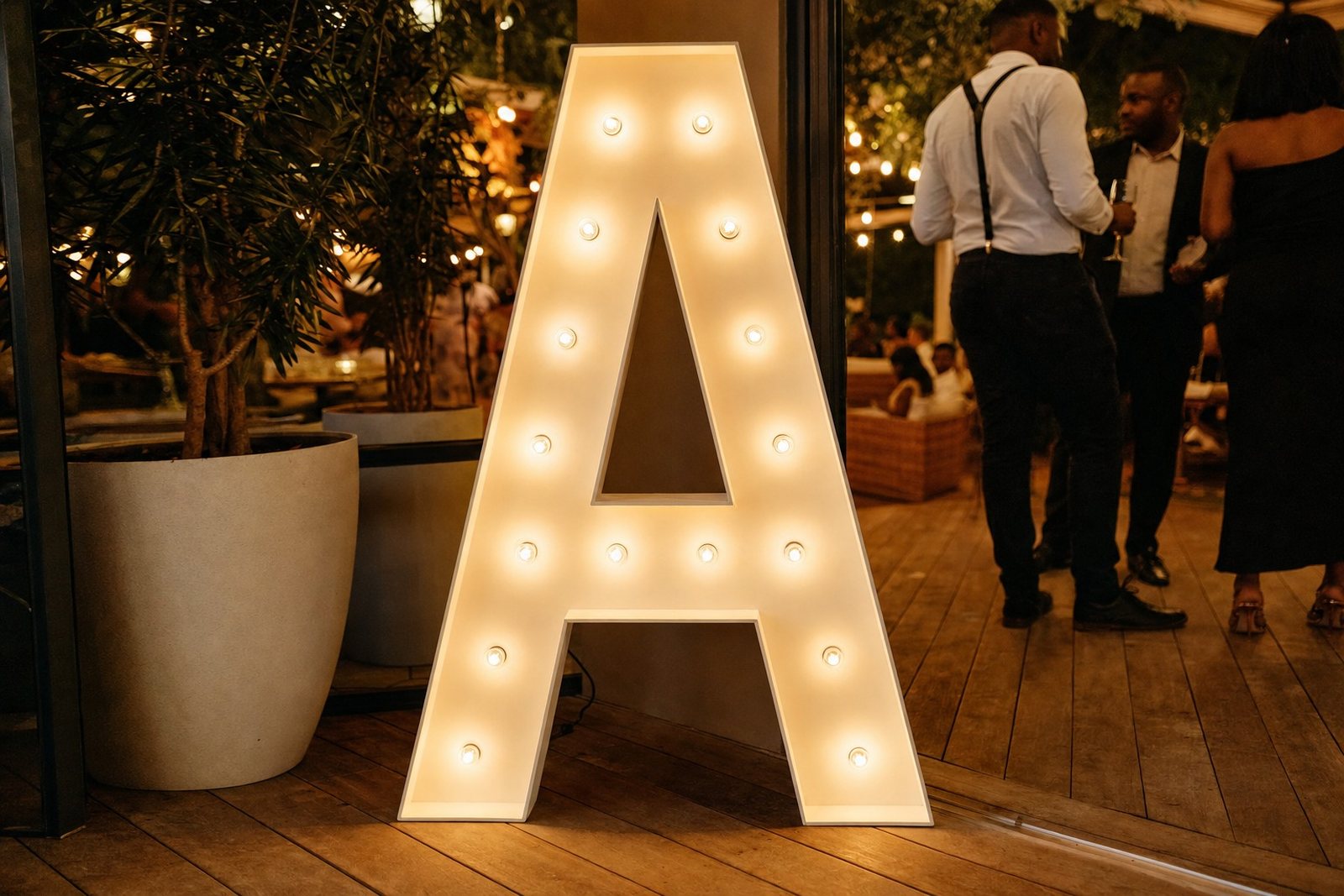
A photo corner works best when it has one clear feature that pulls the eye in. An LED lightbox with names, initials or a short event message does that well, especially when the wording is kept large enough to read from a few metres away.
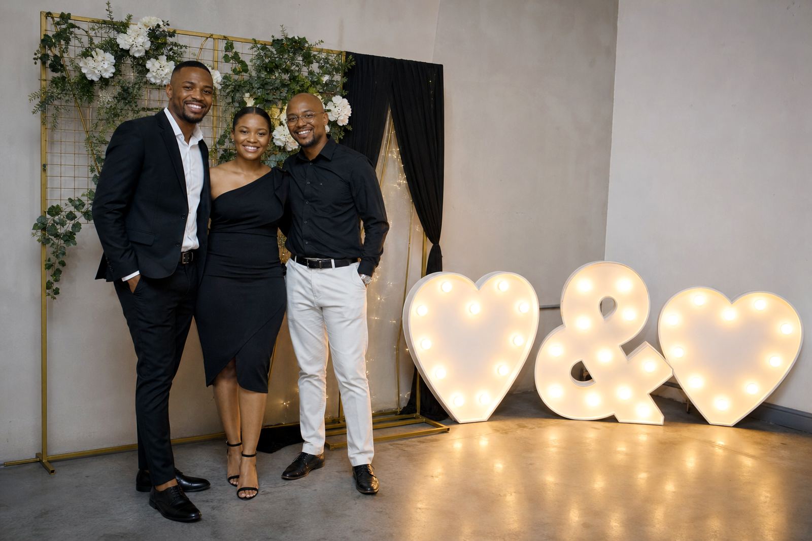
For weddings, the sign can sit behind the couple or off to one side so guests can stand in front without crowding the frame. For product launches and corporate functions, a lit logo style panel gives the corner a cleaner business feel, while marquee letters add height and shape without making the space look busy.
Keep the main feature simple. Too many messages, too many colours and too many objects close together usually create flat photos and awkward shadows.
Plinths Help Build Height Without Filling The Room
Plinths are useful because they lift smaller decorative pieces into the camera line. A pair of plinths can hold floral arrangements, framed details or illuminated props, and that extra height helps the corner read properly from across the venue.
They also stop everything from sitting at floor level, which can make a setup feel heavy and unfinished. In a ballroom or function hall in Midrand, the right height difference between the lightbox, the plinths and any side décor gives the whole corner more depth.
- Use taller items at the back and shorter pieces near the front.
- Leave enough floor space for two or three people to stand comfortably.
- Keep the edges clean so the corner photographs without clutter.
- Match the plinth finish to the room, not only the theme colours.
Balanced Lighting Makes Faces Look Better
Even the best sign looks poor if the lighting washes it out or leaves faces in shadow. A photo corner needs balanced light, not a harsh beam aimed straight at the backdrop. Soft, even lighting lets skin tones hold up better and keeps the lettering visible.
For indoor venues, the lighting should sit close enough to brighten the sign and the people beside it, but not so close that it creates glare on shiny surfaces. Outdoors, especially on Johannesburg and Pretoria evening functions, the setup needs to work with fading daylight and with the venue's safe power points and cabling routes.
Warm light often suits weddings and private celebrations, while whiter light is useful for branded events where clarity matters more than mood. The main point is consistency, because mixed tones can make the photo corner look patched together.
A Layout That Leaves Room For Movement
The photo corner should feel open enough for guests to step in, turn slightly and leave without bumping into décor. That means planning the footprint before the first item goes in. A narrow corner often looks neat on paper, but in practice it causes people to stand too close to the sign and blocks the light.
In venues with tight access, the layout has to suit the route from the loading point to the final position. Safe cable routing matters here, because loose leads across walkways can spoil the setup and create a hazard near drinks, heels and camera equipment.
- Keep the front edge open so guests can step into the frame easily.
- Place cables behind the display wherever possible.
- Check that the power point reaches the full setup without stretching.
- Leave a small gap for attendants to adjust items during the event.
What Works Well For Different Types Of Events
A wedding photo corner usually needs a softer finish, with initials, names or a short phrase and décor that sits quietly behind the couple. A party setup can go bolder, with brighter wording and stronger shapes that read well in social photos. Corporate launches often need a cleaner line, where the lightbox and illuminated letters support the brand without taking over the room.
Out-of-town events need a little more planning around transport and installation order. For a Durban setup, humidity and airflow can affect where materials are placed, while larger Gauteng venues may need a wider loading plan and more careful placement of the lighting points. The format can stay the same, but the handling changes with the space.
A local example is a Midrand reception where a glowing name panel was placed behind two low plinths and a pair of side lights. Guests used the corner all evening because it was visible, easy to reach and not squeezed into a passageway.
The Details Guests Notice In The Final Photos
People often remember the big sign, but the small details decide whether the photos look finished. Clean surfaces, straight wording and even spacing around the frame all help. So does a backdrop that suits the room instead of fighting it.
Before guests arrive, the display should be checked from a few angles. If the sign is too low, it can disappear behind shoulders. If it sits too high, faces get lost under it. If the lighting is uneven, the camera catches the problem immediately.
That is why a photo corner works best when the sign, plinths and lighting are treated as one setup, not three separate items. When they are balanced properly, the space feels easy to use and the pictures carry the same look from the first guest to the last.