
Short wording gives the lightbox room to breathe
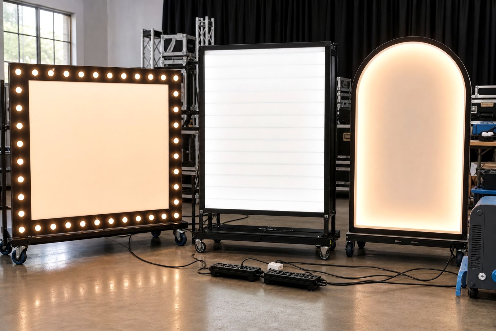
LED lightboxes and illuminated letters work best when the wording is trimmed down to the essentials. A sign with one strong word or a short pair of names gives the light source, letter shape and spacing enough room to stand out without crowding the frame.
In a busy reception space, people move past décor quickly. They notice simple wording first, then the glow around it, then the detail. That is why names, initials and short phrases often create a stronger visual point than a long sentence stretched across a panel.
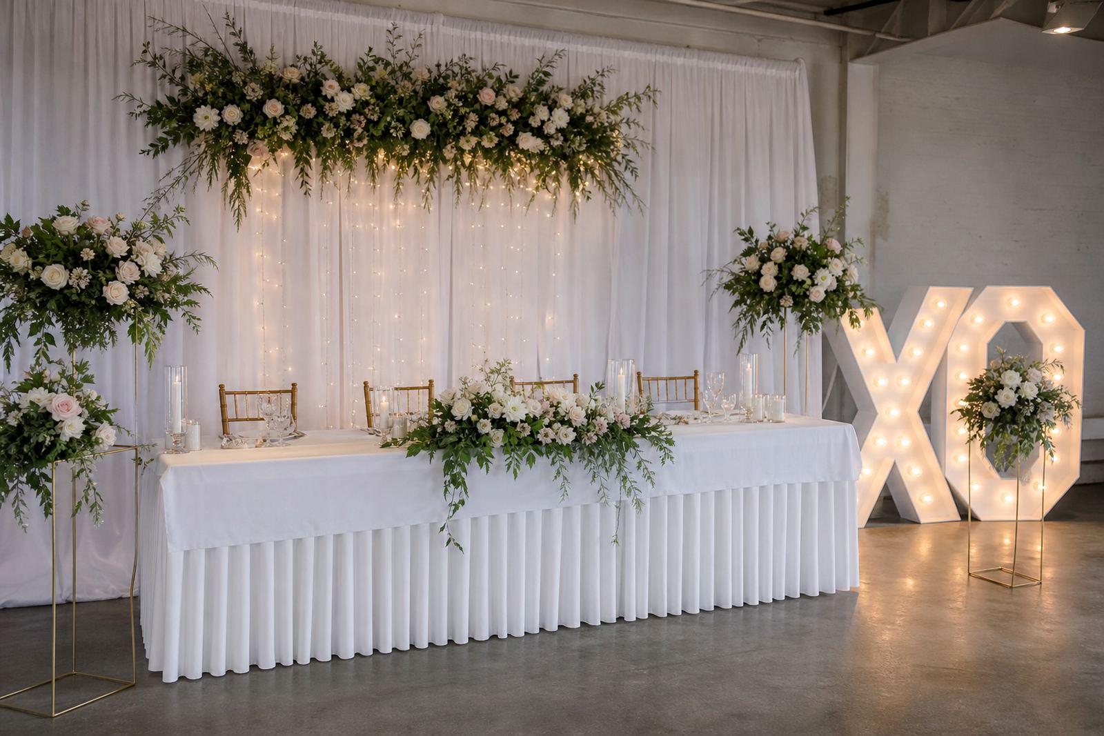
At a Midrand wedding, for example, a bride and groom's first names in tall illuminated letters can do more for the entrance than a full slogan. The same logic applies to a product launch in Sandton or a corporate function in Pretoria, where the message needs to land fast and stay clear from across the room.
Names, initials and one line can do the heavy lifting
When the wording is short, the shape of each letter becomes part of the décor. Marquee letters with a clean name arrangement suit dance floors, head tables and photo spots because the eye can take in the whole word without searching for meaning.
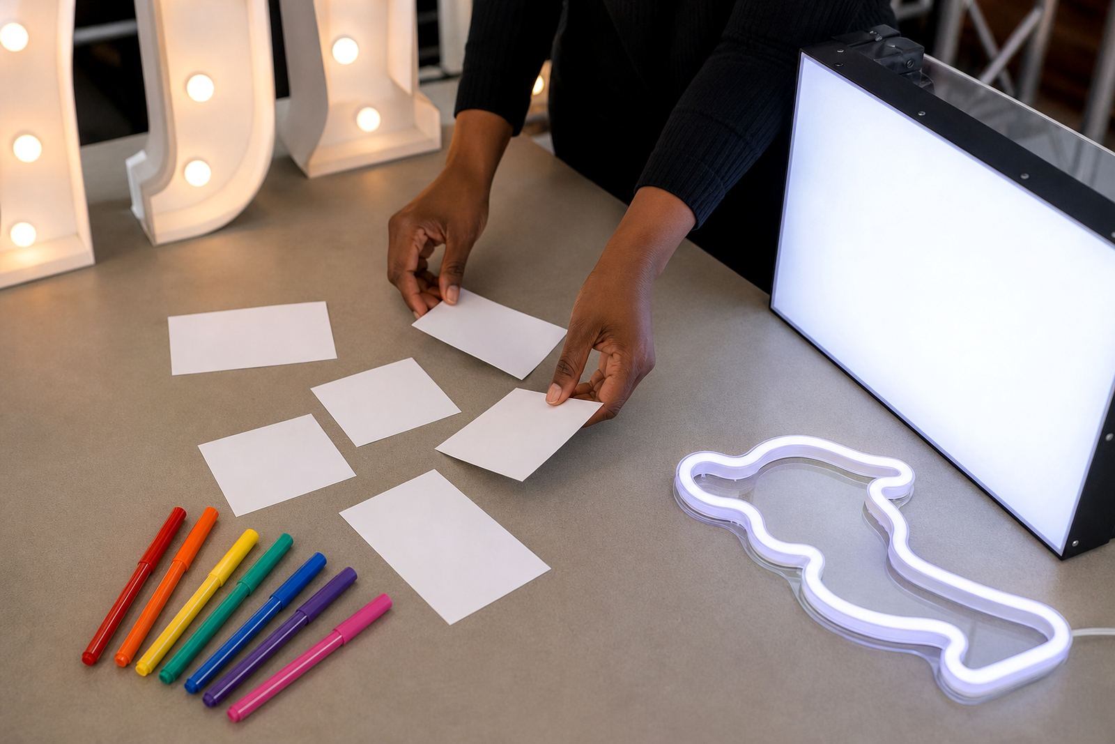
Single words also work well when the event has a clear mood. Think of words like love, celebrate, sparkle or welcome. They are brief, but they still carry feeling and they leave space for flowers, balloons, draping or a backdrop to do their share.
- Short names suit entrances and stage fronts.
- Initials work well where space is tight.
- One word gives more room for glow and spacing.
- Longer phrases need careful sizing so they do not look cramped.
For indoor placement, the cleaner the wording, the easier it is to balance with tables, floral pieces and aisle layouts. A short line also helps the setup crew place the unit safely without fighting for space around the frame.
A message should match the room, not fight it
Every venue has its own shape, lighting and traffic flow. A narrow passage at a Rosebank venue calls for a different sign size than a broad foyer in Centurion or a ballroom in Durban. The wording needs to suit the space as much as the style does.
For corporate events, a brand name or campaign line often works better than a longer explanation. Guests usually see the sign from a distance first, so the wording must stay legible against other décor and moving people. If the message is too long, the glow is lost and the sign starts to feel heavy.
Outdoor placement brings another layer of care. Wind, ground conditions and the route to the power point all matter. Safe cabling and clean routing keep the set-up neat, while the wording stays visible enough for photos and guest arrivals. In humid coastal air, such as parts of Durban, the finish and placement need even more attention.
Local event spaces reward clear reading distance
In Gauteng, event guests often read a sign while walking, talking or finding their seats. That means the wording must work from a few metres away, not only up close. Short text helps because the letters stay bold and the spacing remains easy to take in from across a room.
A photo area in Fourways might use one illuminated word, while a wedding reception in Johannesburg could use the couple's names with a smaller supporting line below. In both cases, the message should be easy to read under mixed lighting and still look tidy in pictures.
Set-up also changes the result. A sign placed too low can disappear behind guests, while one set too high may feel detached from the rest of the décor. The best position usually lets the wording sit where eyes naturally land, with the glow reaching the table line and nearby backdrop without clutter.
- Use wording people can take in while they move through the room.
- Leave space around the sign for cables and stands.
- Match the font weight to the room size.
- View the sign from the doorway and the photo spot to make sure it reads clearly.
Event words should pull their weight in photographs
People remember how a room looked on the night, but photos carry the sign long after the music stops. A short phrase, a clean name or a pair of initials usually photographs better than a crowded block of text because the camera can pick up the form without losing contrast.
That matters for launches, weddings and private celebrations where guests share pictures from different angles. A neat word arrangement can sit behind the couple, beside the cake table or near the bar without competing with every other element in the room. The sign does not need to say much if it is framed well.
Lighting changes the way the words read. Soft indoor lighting gives illuminated letters a warm outline, while brighter rooms can flatten long wording and make it harder to follow. Short text keeps the message clear even when the room lighting shifts during speeches, dancing or photo moments.
Choosing words that suit a real setup day
The best wording is practical before it is pretty. It should fit the frame, suit the venue and work with the route from vehicle to final position. That is why the booking details matter: the size of the sign, the power point position, the floor surface and the exact area where the unit will stand.
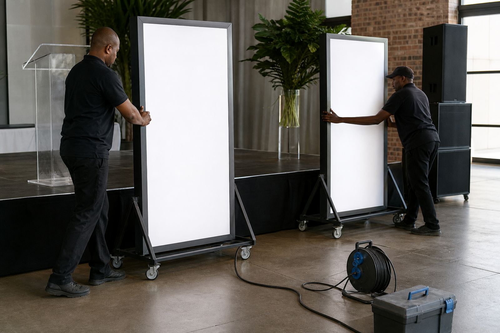
For delivery and set-up across Midrand, Johannesburg, Pretoria, Sandton, Centurion and Durban, short wording also makes handling easier. A compact sign is simpler to move through doorways, place near the backdrop and collect after the event without disturbing the rest of the room.
Safety needs attention here too. Power points need checking, cables need to sit flat and the route must stay out of guest paths. If the wording is oversized, the unit can dominate the space and make placement awkward. If it is kept tight and purposeful, the glow does its job without forcing the rest of the décor to work harder.
A clear word can carry a whole mood
Short event wording is not a shortcut, it is a design choice. It lets the light, the shape and the placement do more work while keeping the message readable from the entrance to the photo area. That is often the difference between décor that feels busy and décor that feels considered.
At LED-Lightbox Rental, the focus is on matching the sign to the room, the route in and the way guests use the space. A clean word choice, correct placement and proper cabling can turn a simple message into the part people remember first. The wording does not need to be long to make an impact. It just needs to fit the space properly.