
Start where people first slow down
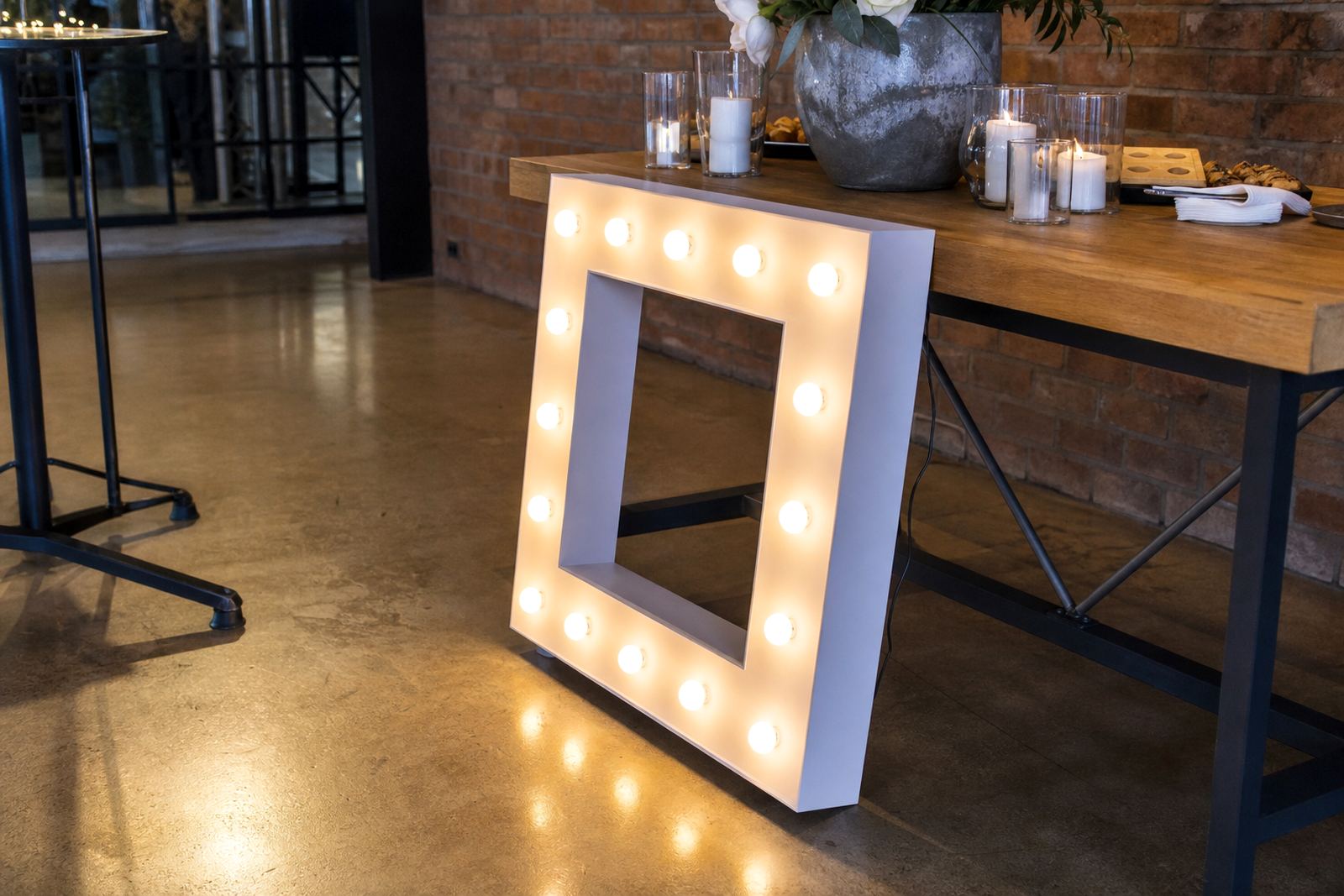
The strongest placement is often the spot where guests pause without being blocked by the crowd. That might be the entrance to a ballroom, the edge of a dance floor, the path beside a cake table or the open side of a photo area. Placing letters where people naturally stop lets the display fit the event flow and keeps it clear of guest movement.
For weddings, initials often work well near the reception entrance or behind the couple table. At a party, a name, number or short word can sit beside the bar or dessert table where people gather. For launches and company functions, illuminated letters are often better close to the stage or media wall, where they support brand visibility without crowding the room.
A few placement questions help shape the layout:
- Will guests walk past the display or stand in front of it?
- Will the letters sit in full view from the main seating area?
- Is there enough space for photos without blocking service points?
- Does the position leave room for cables to run safely and neatly?
Let the backdrop carry part of the display
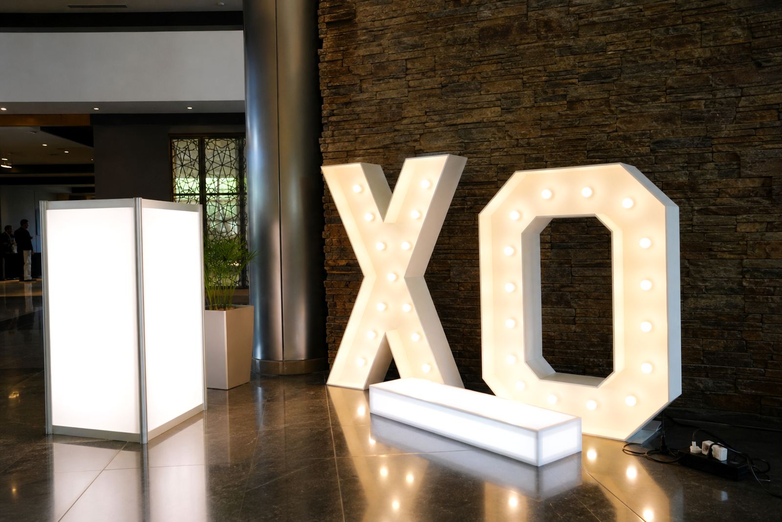
Letters and lightboxes read better when the background is calm. A plain wall, curtain drop, greenery panel or uncluttered stage fascia helps the shape stand out. If the backdrop already has many patterns, bright colours or competing signage, the letters can lose their impact even when the lighting is good.
At indoor venues, a clean wall with a little depth behind the display usually gives the best result. For outdoor events in Gauteng, shaded areas and covered courtyards often work better than open sun, because hard daylight can flatten the glow from illuminated signs. Coastal humidity in Durban also makes it worth checking where the display will sit if the event runs late into the evening and the air becomes damp.
Useful backdrop choices include:
- plain walls or draped panels
- soft florals that frame the sides, not cover the letters
- low platforms for added height
- clear floor space for photo angles from front and side
Keep photos in mind before you fix the position
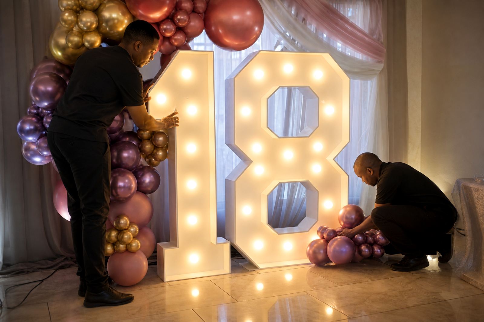
Most letter displays are installed for photographs as much as for decoration. That means the front view matters, but so does the angle from which guests will actually take pictures. If the letters are too high, heads get cut off. If they sit too low, people crouch or block the word while posing.
A medium height with a little room around the sides usually works best. This gives guests enough space to stand in front of the display without squeezing into each other. For marquees or larger illuminated letters, the arrangement should allow for a clean shot from about three to five metres away, depending on the room size and the camera angle.
When the display is part of a photo area, these details help:
- Keep open space in front of the letters so guests can stand there comfortably.
- avoid placing tall décor directly in the line of sight
- check that the wording reads well from the main camera side
- set the lights so the faces and signage both show properly
Traffic, tables and the spaces people actually use
A good layout respects the route people take through the venue. If the letters sit too close to a doorway, buffet line or service aisle, they get bumped, hidden or ignored. A display that looks fine on a floor plan can cause trouble once chairs, waiters and guests start moving.
For corporate events in Sandton or Centurion, letters often work best near the registration zone, stage edge or branded photo point, where they support the event without narrowing the passage. For birthdays and weddings, the safest positions are usually beside open walls, at the end of a room or against a feature backdrop with enough breathing space around them.
That extra space also helps with cable routing. Venue power points should be checked before the install so the lead length, plug position and cable path are planned properly. Safe cabling matters most where guests are walking in formal shoes, children are moving around or the venue has polished flooring that can show every line.
Indoor rooms and outdoor lawns need different thinking
Indoor placement gives more control over light and access to power, but the room shape can still make the display tricky. A narrow venue may need a single line of letters rather than a wide spread. A high-ceiling hall might need a stronger focal point so the sign does not feel small in the space.
Outdoor placement needs extra care with wind, ground level and evening lighting. On lawns or paved terraces, the base should be level and the position should allow for a secure setup. If the event is on a sloped area or near a pool, the layout has to be adjusted so the display stays stable and practical for guests and crew.
For outdoor use, these checks matter most:
- firm ground under each unit
- clear access to a suitable power point
- safe cable routing away from foot traffic
- enough space for setup, photos and collection later
Midrand wedding letter placement
At a Midrand wedding reception, a couple of illuminated initials placed behind the main table can shape the whole room without taking over the décor. If the table sits near a plain wall, the letters give the photographer a clean anchor point while guests still have clear movement around the seating area. The look stays neat, but it also feels intentional rather than pushed into a corner.
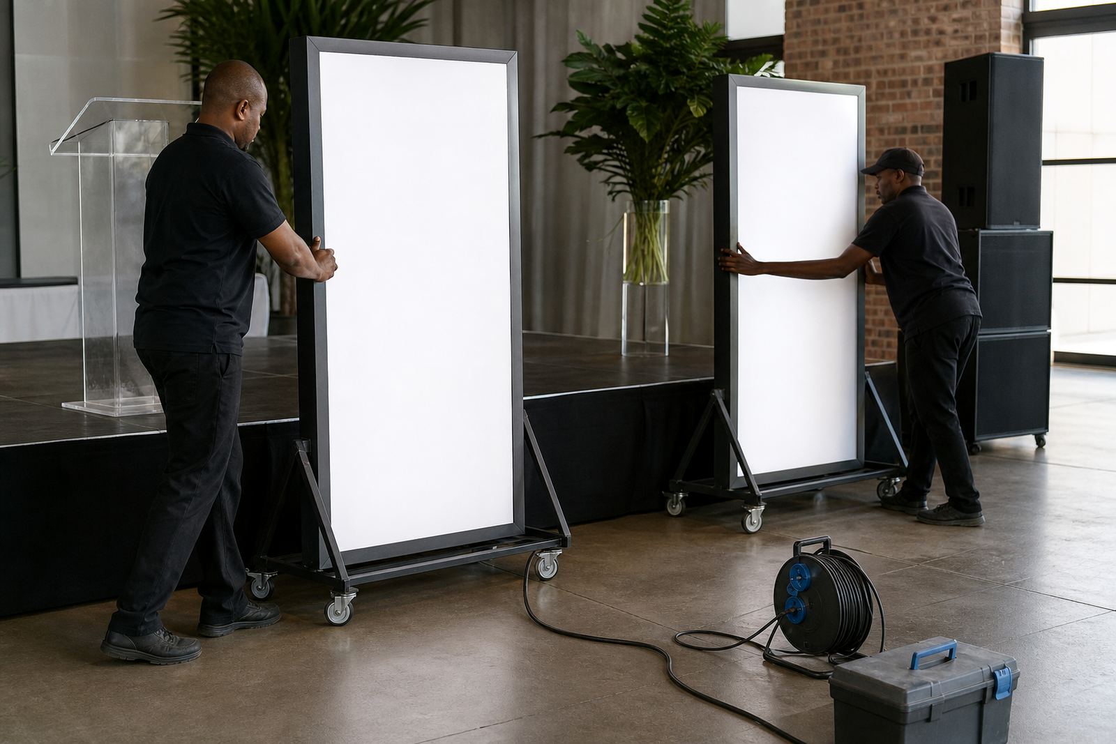
The same thinking works for a company launch in Johannesburg or Pretoria. A branded lightbox at the entry point can greet guests, while a second display near the stage carries the same visual line through the room. That kind of spacing works well when the venue has multiple focal points and the décor needs to guide movement from one area to the next.
It helps to think in layers:
- first focal point at entry
- second focal point at photos or stage
- clear walking line between them
- no cable crossing the guest route
The last check before the lights switch on
Before the event starts, the display should be checked from the guest side, not only from the install side. That means looking at spacing, tilt, brightness and whether the wording reads clearly from the main room. If the piece is slightly off-centre, or the background is too busy, a small adjustment can make a large difference.
At collection time, the position should also make removal straightforward. A well-planned install is easier to take down after a late finish, especially when the venue has limited access or the event runs into the evening. Good placement saves time during setup and protects the display during collection too.
When the job is done well, the letters feel like they belong to the space. They support the photos, guide the eye and leave the room balanced instead of crowded.