
When initials do the job cleanly
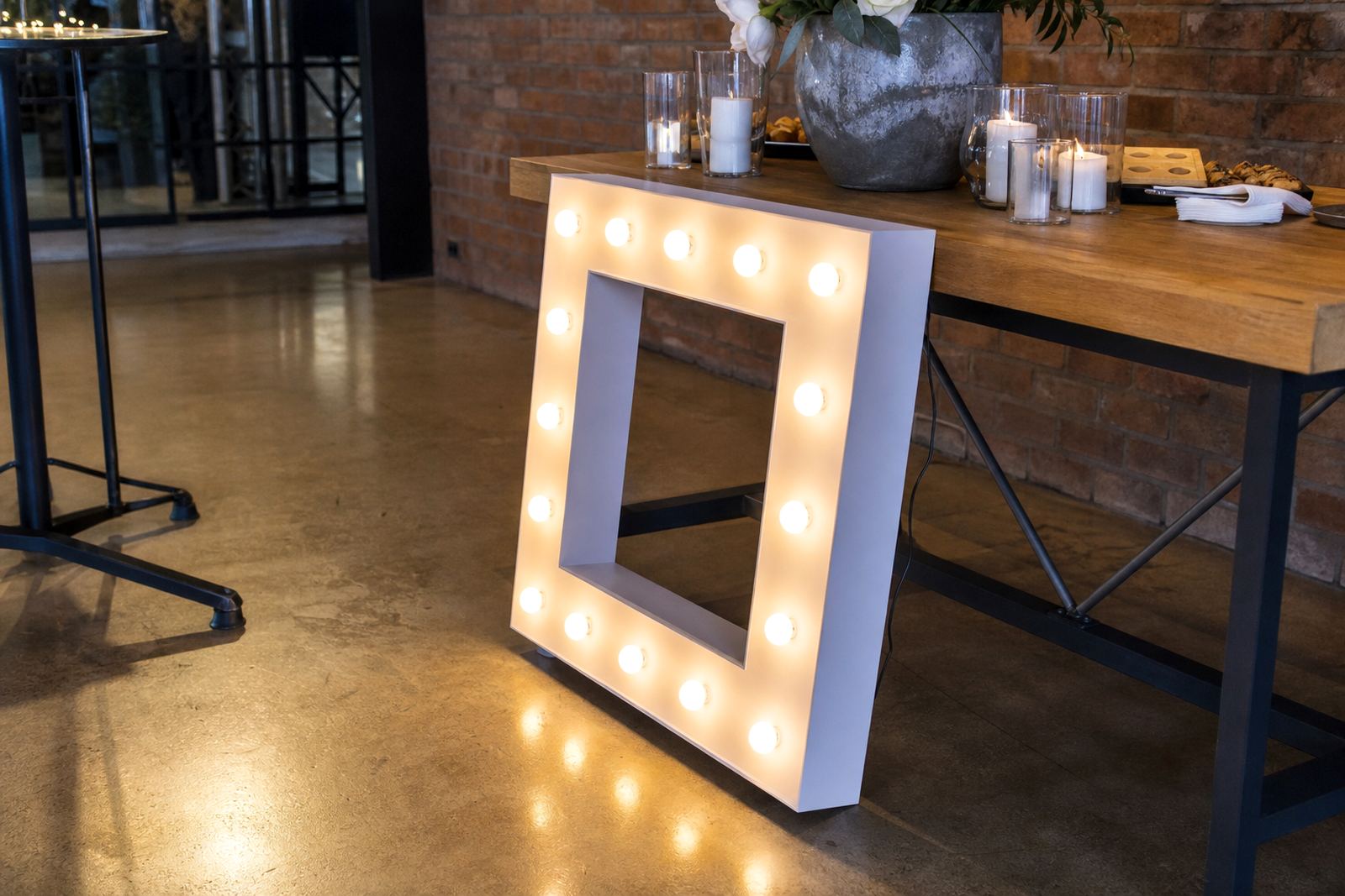
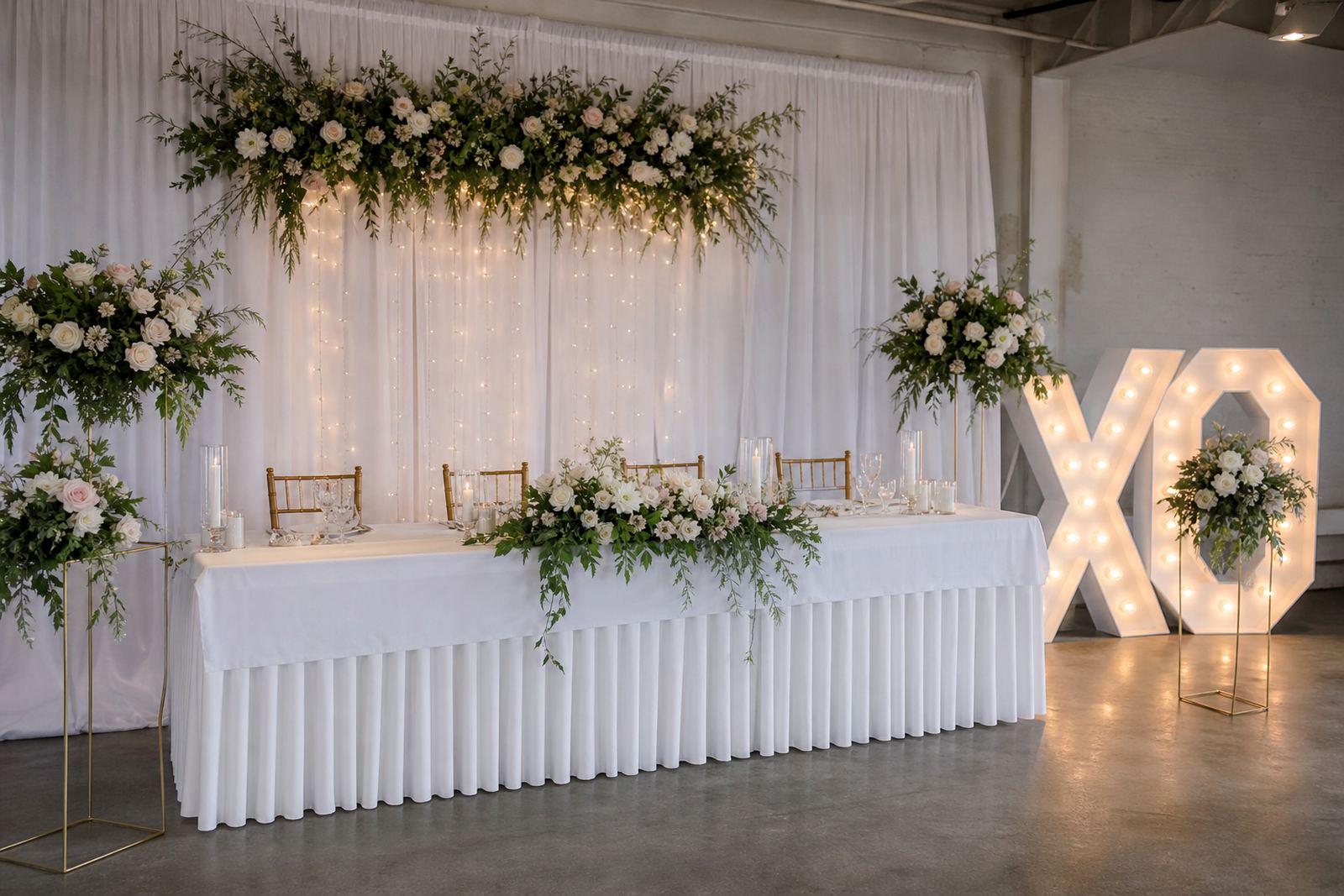
Initials work well when the room already tells the story. A couple may want their first letters on a welcome wall, or a company may use initials where the audience already knows the name. The look is tighter, the footprint is smaller, and the sign can sit neatly beside flowers, draping, or a backdrop without taking over the frame.
That said, initials need context. A guest entering a reception hall in Midrand may understand a monogram straight away, while a passer-by at a launch in Sandton may not. If the lettering is meant to photograph well, the shape of each letter matters as much as the light inside it. Clean spacing and balanced proportions help the sign read well from a few metres away.
- Best for monograms, couple initials, and short labels
- Works well on compact stages and narrow photo areas
- Feels restrained when the rest of the décor is already detailed
Where complete wording earns its place
Complete wording gives the clearest message. A company name, a birthday message, or a short phrase in illuminated letters leaves less room for guesswork. At a corporate function in Johannesburg or a party in Pretoria, that can matter when guests are moving around quickly and only catch the sign for a moment.
Full wording also gives more control over the tone. A simple phrase can feel formal, warm, or playful depending on the font and the spacing. For weddings, names and a short shared word can anchor the photo spot. For product launches, wording can support the brand message without needing extra printed boards around it.
Longer wording does need more wall width or floor depth. If the venue has a narrow stage edge, a full sentence can start to feel crowded. In those cases, the size of each letter, the line break, and the viewing angle all need careful handling.
- Clear for guest directions, launch names, and event phrases
- Better when the message must be read in one glance
- Needs more planning for spacing, height, and placement
How the venue changes the choice
A ballroom, a garden, and a tent do not treat light the same way. In a darker room, smaller initials may glow well enough for the camera and still feel understated in person. In a brighter space with daylight spilling in, full wording often holds its shape better because the letters have more presence.
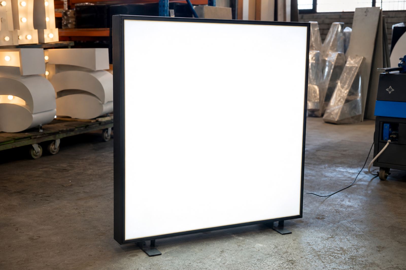
Power points also shape the layout. LED lightboxes and illuminated letters need safe cable routing, and the route from the nearest socket to the sign should stay tidy and out of walking paths. When the venue has a clear plug point near the wall, the setup is simpler. If the sign is going into the middle of a photo area, the cable plan needs more care and the placement may shift by a metre or two.
Outdoors, the ground surface matters. Grass, paving, and uneven edges all affect how the frame or base sits. The sign has to be visible, but it also has to stay steady through the evening. That is where a measured setup helps more than a big sign with no thought behind it.
Midrand weddings and Gauteng events
Picture a wedding reception in Midrand with the photo area set beside the dance floor. If the couple wants their initials in lights, the backdrop can feel elegant and compact. The letters sit well beside florals and do not compete with the table décor. If the same room needs a message that reads from the doorway, full wording is the stronger choice.
Now shift that job to a corporate function in Sandton. Guests arrive in small groups, photographs are taken quickly, and the sign may appear in many social media frames. Full wording can support the company name or campaign line more directly, while initials may only make sense to people already close to the brand. In Pretoria, where a venue might have a wider entrance or a longer photo wall, there is often more space for a full phrase without losing balance.
For delivery and set-up across Gauteng, the choice often comes down to what must be seen first. If the event needs atmosphere only, initials can do a lot with little space. If the message must travel across the room, wording gives the sign more work to do.
The quiet details that change the result
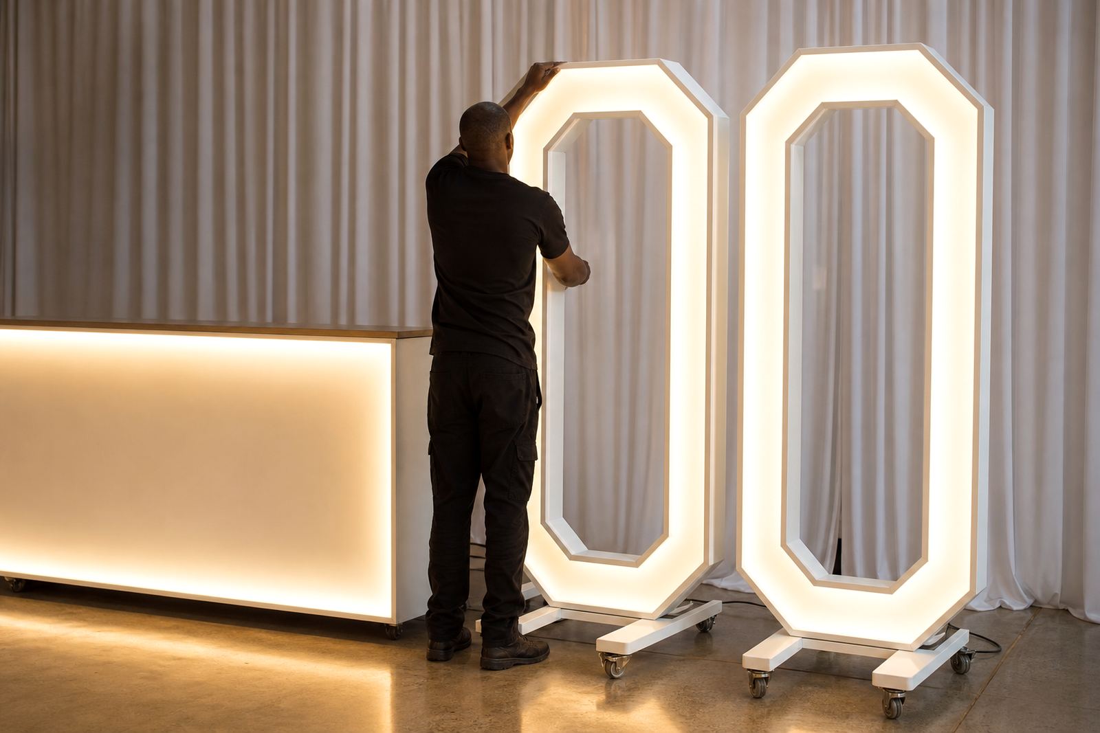
The sign is one element in the overall set-up. The finish around it, the height off the floor, and the distance from the camera all shape the final image. A tall marquee letter can look striking in a wide hall, but in a tighter venue it may hide behind florals or cake tables. A lower line of wording may read better than a taller stack of initials if the backdrop is busy.
- See whether guests can read the sign clearly as they come in
- Keep the cable path neat and away from foot traffic
- Match the size to the distance guests will stand back
- Think about how the sign sits with flowers, furniture, and lighting
Late-night collection matters too, especially where the event programme runs into the evening. A sign that was perfect at setup can look cramped once chairs move, speeches end, or the dance floor opens. The collection plan should allow space for staff movement and for the venue to reset without stress.
Picking the option that fits the message
If the goal is style first, initials often feel lighter and more refined. If the goal is clarity first, complete wording usually wins. Most event plans need a mix of both thinking: how it looks in photos, how quickly it reads, and how it sits inside the room. That is where LED lightboxes, marquee letters, and neon-style signs each have a place.
For some events, a single bold feature is enough. Others need a sign that supports the whole layout, from welcome area to stage edge. A couple in Johannesburg may want initials for the photo area and a short illuminated word near the cake table. A launch in Centurion may need the full company name at the entrance and a smaller lightbox inside the venue. The best choice keeps the message clear without making the room feel crowded.
For bookings, delivery, set-up, collection, and out-of-town logistics, the details are best matched to the venue, the surface, and the power points already in place. That is usually where the final choice becomes obvious.