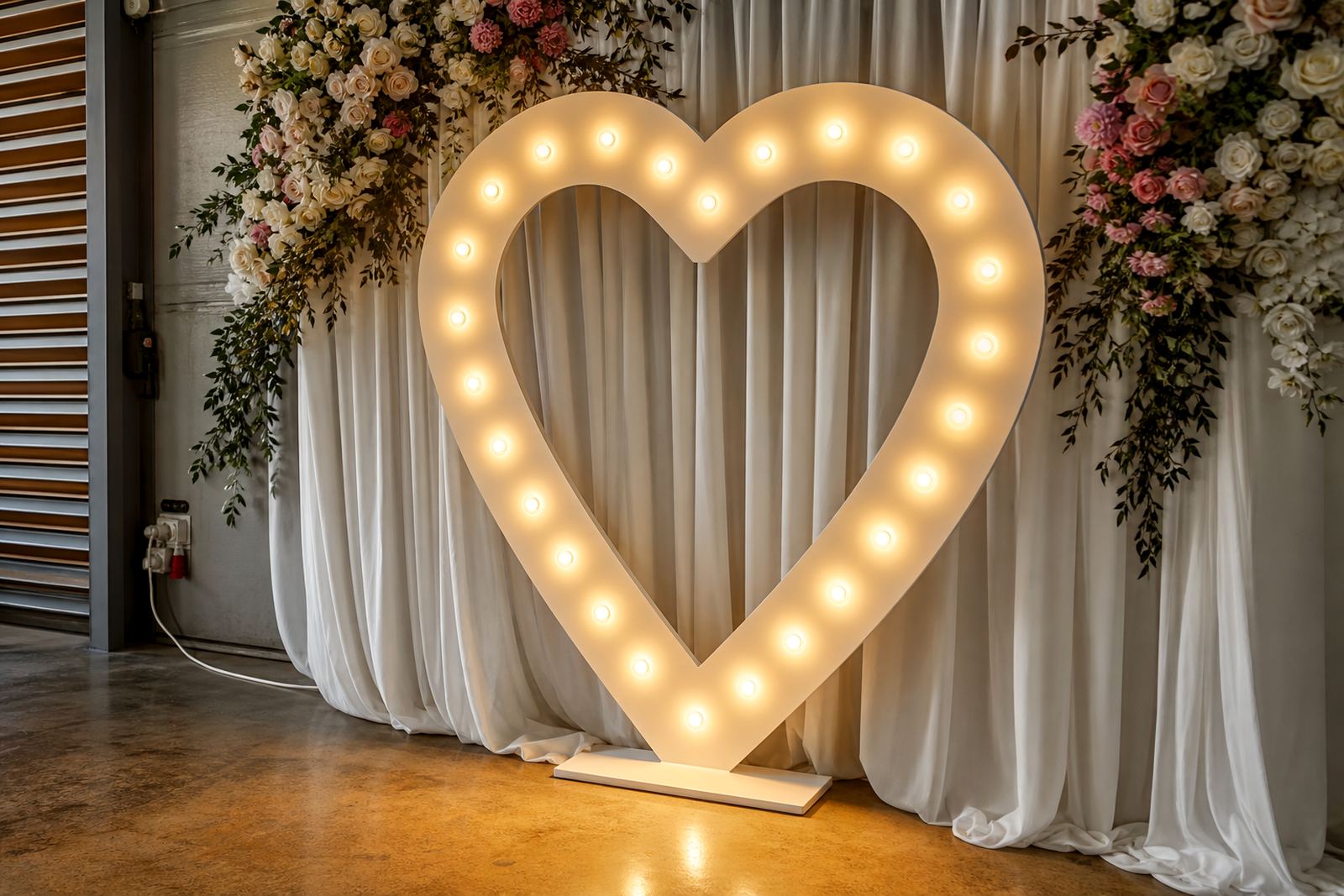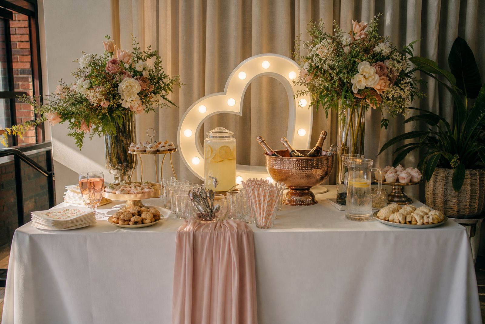


First contact point, first impression
A registration table is often the first real touchpoint at a corporate event, and the lighting around it carries more weight than many planners expect. If guests arrive in a hotel foyer, conference centre lobby or tented entrance, they need to spot the brand, the check in point, and the direction of travel at a glance. LED lightboxes and illuminated letters do that job without crowding the space.
In practical terms, the setup needs to work for people who are walking in with badges, bags, lanyards and a long list of questions. Bright face-lit branding makes the counter or counter stand out from the rest of the venue, while smaller directional signs can guide guests to pre-registration, seating or waiting areas. Clear wayfinding reduces mix-ups and helps people move through the line without unnecessary hold-ups.
For Midrand events, especially those using hotel entrances or shared foyers, space is often tight. A lightbox placed at eye level beside the registration point, with one or two matching illuminated letters, gives the area a clean focal point without taking over the floor. It also photographs well, which matters when event teams are capturing arrival images for internal records or sponsor use.
What lit branding does at a busy check in
Registration areas do not need decoration for its own sake. They need visible structure. A lit sign can carry the event name, a conference theme, a sponsor mark or a simple welcome message, while directional pieces point guests to the right counter or section. When the venue is large, those visual cues save staff from repeating the same instructions all morning.
- Lightboxes work well for welcome messages and branded panels.
- Marquee letters add height and are easy to read from a distance.
- Neon-style signs suit compact areas where wall space is limited.
- Directional signs help split VIP, general and media registration.
- Photo area layouts can double as a visual anchor near the entrance.
The lighting itself should be even, not harsh. A registration point with washed out signage looks tired, while a sign that is too dim can disappear into the background. The right balance depends on whether the area is under natural light, inside a shaded foyer, or placed against darker draping. Small details make the difference, and a slight misread at the entrance can slow everyone down.
Planning for venue power points and safe cable routing
Most registration lighting setups rely on venue power points, so the layout needs to be planned around actual access rather than ideal positions on a sketch. That means checking where the nearest sockets sit, whether the route crosses walkways, and how the cabling will run without creating a trip hazard. Safe cable routing matters just as much as the sign itself.
At a corporate venue in Sandton, for example, a registration area may sit in a lobby with polished floors and a narrow traffic lane between the doors and lifts. In that kind of space, the lighting must be placed with care. Cables need to be secured neatly, equipment kept stable, and any lit item positioned so guests do not brush past exposed leads while signing in.
- Confirm where the nearest power point is located before set-up.
- Keep cables along edges, not through the main walking line.
- Use equipment stands or backing that will not tip easily.
- Keep the lit face visible from the entrance, not hidden behind staff.
- Allow enough room for queues, badge handover and guest bags.
Outdoor registration needs even more thought, especially when the check in counter is placed near a driveway, courtyard or temporary entrance. Weather exposure, uneven paving and late arrivals all change the layout. The gear should be positioned where it remains visible, but also where staff can work without crowding each other.
Shaping the route from door to sign-in
Directional lighting is useful when the registration point is not immediately visible from the venue entrance. A guest should not have to stop and ask twice. A small lightbox pointing left or right, or a pair of illuminated letters marking the correct lane, can steer the flow before the queue builds up.
For larger launches and conferences, the route often starts with a welcome sign, then moves to a split between guest types. That is where illuminated signs earn their place. They can mark general registration, VIP access, speaker check in, media collection or a separate badge counter. The structure is clear and the guests read it fast, which is exactly what a first stop needs.
We often see the best results when the lighting matches the event tone. A formal corporate summit may need crisp white illumination and restrained branding. A product launch or year-end function can use bolder lettering or a neon-style line that works with the rest of the decor. The point is not to overpower the room, only to make the process obvious.
Local set-up across Gauteng and beyond
Midrand sits in the middle of a busy event corridor, so registration lighting often has to travel to Johannesburg, Pretoria, Sandton and Centurion, with Durban included for selected out-of-town work. Each area has its own venue habits, loading points and entry layouts, so the set-up plan changes from site to site. A foyer in Rosebank can call for a very different sign position than a hotel conference space in Fourways.
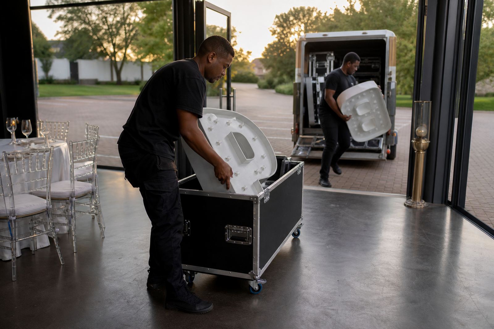
Delivery, set-up and collection all matter because these pieces are not just dropped off and left. They need to be placed straight, powered safely and checked in context with the venue flow. Our team works with multi-item installs when a registration area needs more than one sign, for example a main welcome box, a directional piece and a branded photo point nearby.
- Midrand and Johannesburg events often need tight foyer placement.
- Pretoria venues may give more space, but longer walk lines.
- Sandton venues often require cleaner sightlines and neat cabling.
- Centurion layouts can suit wider entry zones and layered signs.
- Durban jobs need extra care where humidity and coastal conditions are part of the brief.
That local spread also helps when an event has a late evening finish and collection needs to fit the venue schedule. The lighting can be removed without disturbing the registration team, the chairs or the sponsor stands still in place.
What helps a registration area work properly
A well lit registration point should do three things at once: guide people, support staff, and look neat in the room. The best layouts keep those three tasks in balance. Too little light and the branding disappears. Too much and the space starts to feel cluttered. The cleanest result usually comes from one clear focal sign and a short route of smaller direction pieces.
Corporate teams also benefit from thinking about the practical rhythm of arrival. Staff need enough surface area for lists, labels and badge bundles. Guests need a visible sign from the doorway. Security or ushers may need an obvious marker if traffic is being split across more than one counter. When all those pieces sit together properly, the front of the event feels organised from the start.
What you get is practical, not flashy. Guests find the right place quicker, staff work without shouting over each other, and the venue looks considered without being overdone. That is exactly what registration area lighting should deliver.