
Start with the guest path, not the backdrop
Corporate signage should guide people through the event in the same order they experience it. That means thinking about arrival, registration, stage time, refreshment breaks and photo moments before anyone talks about lettering styles or frame sizes. When the layout follows the guest path, the signage does useful work instead of sitting in one corner for decoration only.
A clear arrival point usually needs the strongest visual cue. A lit sign at the entrance, reception or step-and-repeat area helps guests know they are in the right place. From there, smaller boards can point toward seating, toilets, the bar or the venue office. If a room has several sections, the message should change as people move through it.
- Use one main sign for the arrival point.
- Repeat the event name in smaller formats where people turn or queue.
- Place direction signs where guests naturally pause.
- Use brief wording that guests can take in while they move past.
LED lightboxes do the heavy lifting indoors
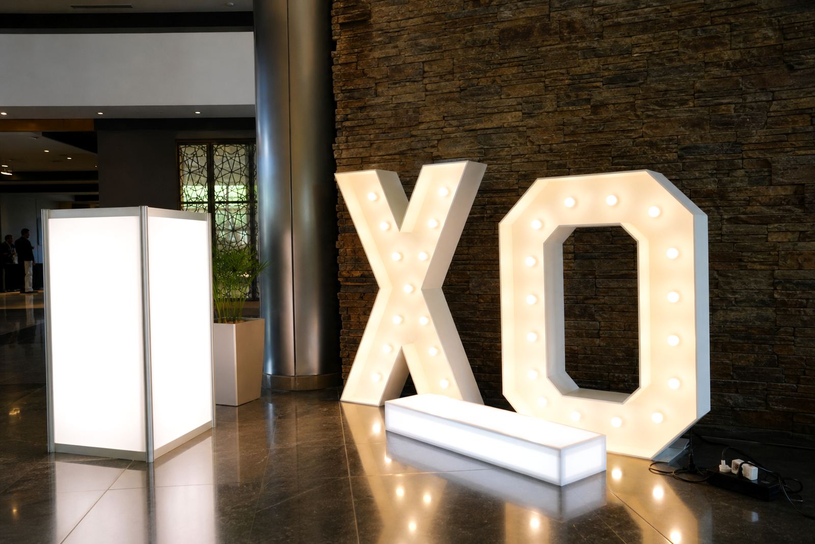
LED lightboxes work well for corporate launches, awards evenings and product reveals because they stay readable in low light and hold their shape across a long event. They suit entrance foyers, stage sides, media walls and branded corners where the camera will spend time. The glow gives the message a clean edge without needing extra decoration around it.
For indoor placement, the frame height, viewing distance and room lighting all matter. A sign that looks perfect at close range can disappear once people stand back for speeches or group photos. In a larger hall, the text needs enough contrast and generous spacing between words. In a smaller meeting room, the sign should stay neat and not crowd the tables or AV gear.
- Choose signage dimensions that suit how far the audience will stand from it.
- Keep text short and legible from across the room.
- Place the lightbox where ceiling lights will not wash it out.
- Leave enough clearance for cameras, stands and walkways.
Marquee letters work best when they carry one message
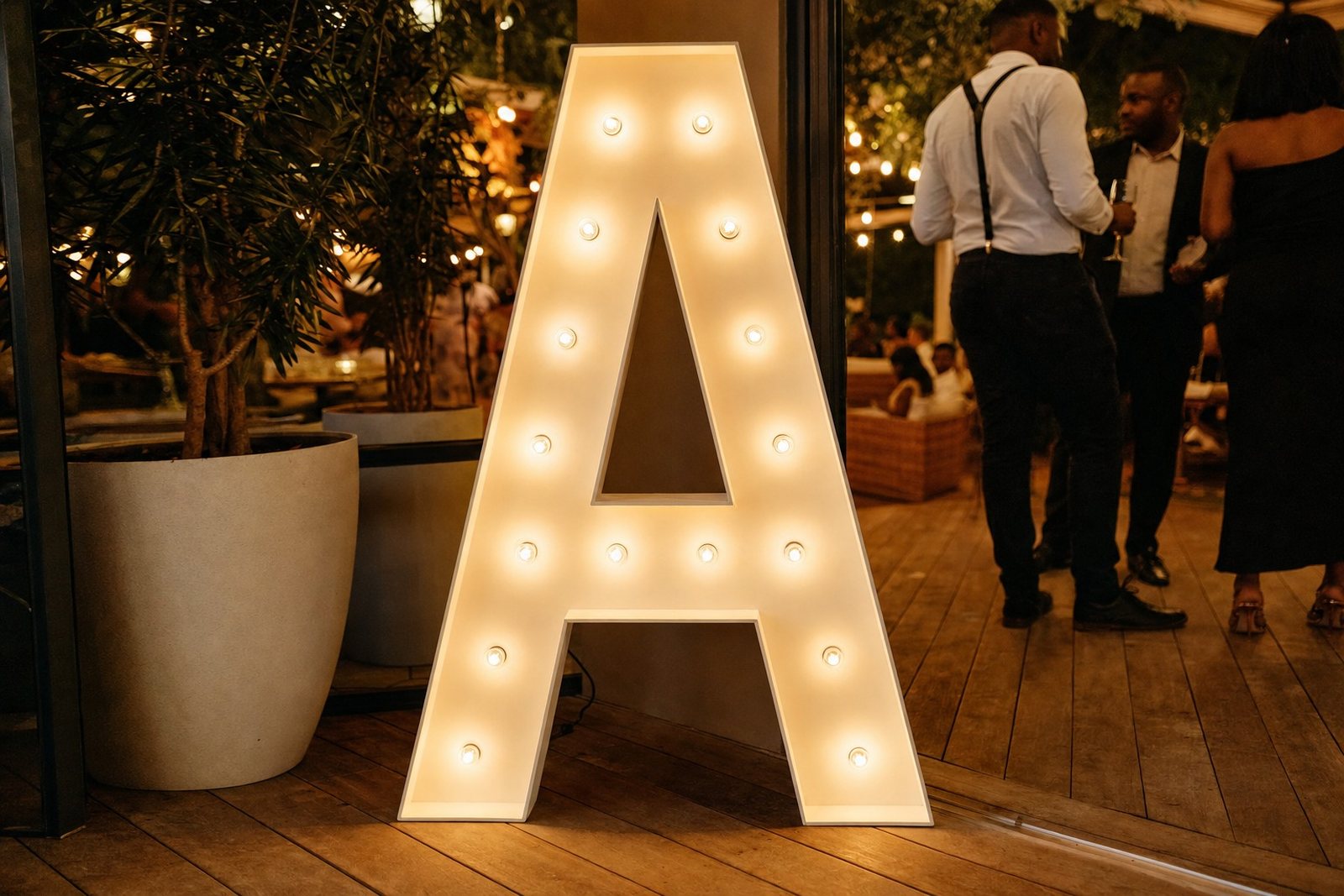
Marquee letters suit corporate events when the message is bold and limited to a few words. A brand name, product title or launch slogan reads well in large illuminated letters. If the message becomes too long, the impact drops and the setup starts to feel cramped. One strong phrase is usually better than a line of small words.
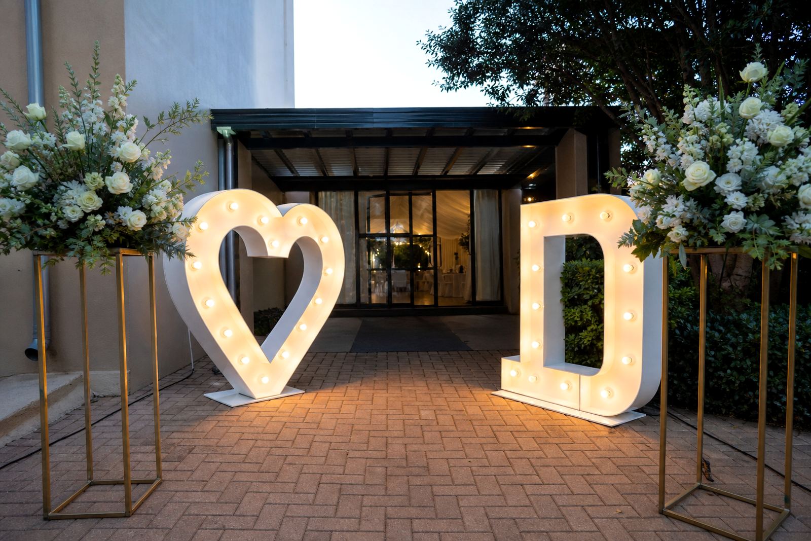
These letters often sit near the entrance, behind the speaker area or beside the photo point. They also work well in reception spaces where guests gather before the formal part begins. For outdoor use, the base position must stay level and secure, especially where wind can catch the sides. The right placement keeps the letters looking deliberate instead of temporary.
- Keep the wording short and visually balanced.
- Use the letters where guests stop, not where they rush past.
- Check the floor or ground is level before the install.
- Allow space for safe access during collection.
Power, cables and placement need quiet planning
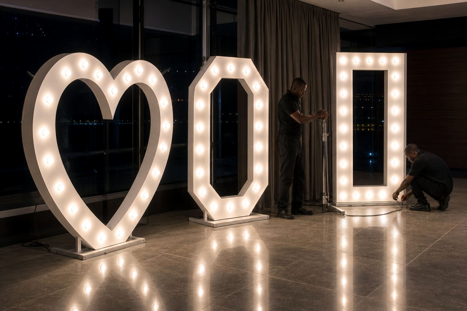
Most illuminated signage depends on venue power points, so the setup has to start with the practical side of the room. A sign may look simple, but the cable route, socket position and access path all need attention before the event opens. Safe routing matters for guests, staff and photographers moving through the space.
A good setup keeps cables out of foot traffic and away from chair legs, drink stations and loading doors. When the nearest socket is far from the chosen spot, we may shift the layout slightly so the installation stays neat. At corporate venues across Midrand, Sandton and Johannesburg, this often separates a neat finish from a rushed one.
- Identify the nearest usable power point before the install begins.
- Route cables along walls, edges or behind props where possible.
- Keep joints and adaptors clear of wet areas and walkways.
- Test the sign in its final position, not only at the loading bay.
Programme flow should shape the wording and order
Corporate signage works harder when it follows the programme rather than the other way around. The welcome sign should appear first, then wayfinding, then the feature piece for speeches or photography. If a launch includes multiple moments, the signage can support each one in sequence instead of trying to do every job at once.
That order also helps with collection and venue handover. When signs are placed in a planned sequence, the setup team can manage access more cleanly, and the event staff know which pieces matter most at each point in the evening. It keeps the room readable from the first guest arrival to the final photo.
- Lead with arrival and registration information.
- Move to stage, photo and sponsor areas later in the flow.
- Keep sponsor names and brand marks consistent across all pieces.
- Choose signage that suits the tone of the event.
A Midrand launch can show the difference
At a corporate launch in Midrand, a lightbox at the entrance can guide guests from the foyer to registration, while marquee letters near the stage give the evening a clear focal point. A smaller illuminated sign beside the photo area can repeat the event title without crowding the room. That mix gives the venue structure and gives the photographer a clean background to work with.
For a guest list that includes clients, staff and suppliers, the benefit is practical. People know where to go, the event team can direct movement without shouting over the music, and the branded pieces stay visible in the pictures. When the signage is clean and the placement is planned, the room feels organised from the first minute to the final collection.
- Use one strong sign at the entrance.
- Repeat the title in a second, smaller format near photos.
- Keep the colours and lighting consistent across the venue.
- Leave enough space for catering, speeches and guest movement.