
When the sun goes down, the sign carries the room
Evening events give illuminated features a different job. In daylight, guests read the sign and move on. After dark, the same piece becomes a fixed point that helps people find the entrance, the photo area, the stage or the bar without asking around.
That shift matters for weddings, birthday dinners, brand launches and year-end functions. A lightbox that looks neat in a foyer can look flat outdoors at dusk if the lamp power, placement or viewing angle is wrong. For marquee letters, spacing matters as much as the letters themselves, because uneven gaps show up straight away once the room is dimmer. A clean layout keeps the sign readable from a few metres away and still holds its shape in photographs.
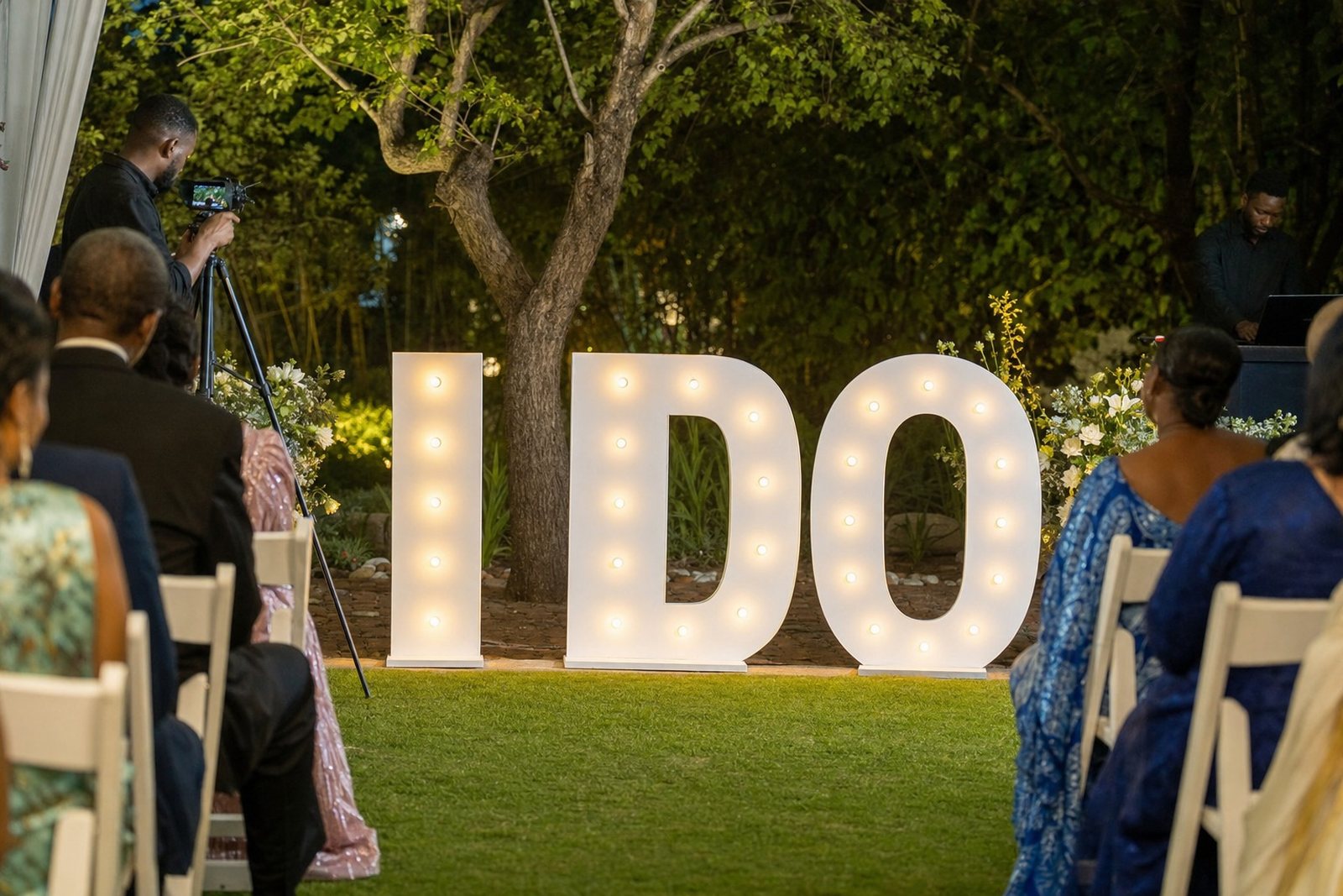
In Midrand and across Gauteng, evening venues often mix indoor and outdoor sections. That means the sign has to work with warm room lighting, reflective floors, garden paths and camera flash. The practical side is simple enough: place the feature where guests naturally look, make sure the cable run stays tidy, and use enough surrounding space so the display does not feel crowded.
What actually works for after-dark visibility
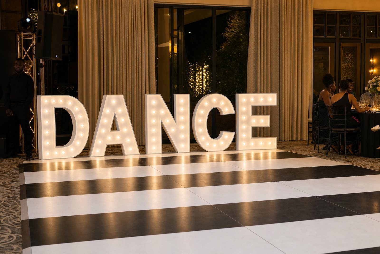
Not every illuminated piece suits the same setting. A slim neon-style word can suit a cocktail wall or a smaller reception space, while larger illuminated letters suit a stage front, entrance lawn or dance floor edge. LED lightboxes are useful when a message, monogram or directional cue needs to be seen clearly from further back.
- Pick a size that matches the viewing distance, not only the floor space.
- Keep the face clean and free of glare from nearby uplights.
- Leave room for guests to stand and take photos without blocking the sign.
- Place the lettering where the backdrop stays quiet and does not pull attention away from it.
- Check whether the venue has a suitable power point near the planned position.
At evening functions, the wrong corner can hide a good sign. A dark wall may make a white lightbox pop, but a busy patterned backdrop can weaken the effect. The aim is not to overfill the room, just to place the illuminated piece where eyes naturally settle. That is often the entrance, the main wall behind the couple, or a photo area set a few steps away from the dance floor.
Venue power points, cables and safe placement
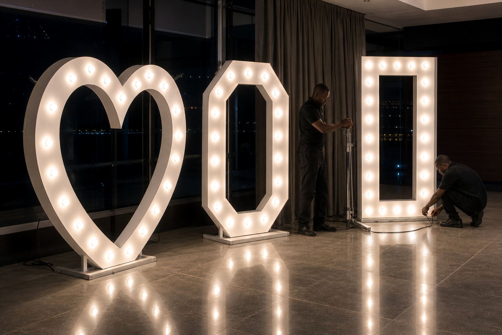
Power matters more once the venue is already dressed for the night. A lightbox or illuminated letters need a stable connection, and the cable route has to stay out of walkways, camera angles and serving space. When the venue has a usable power point nearby, the set-up stays neat and the display sits where it should. If the plug is farther away, the route needs careful planning so it does not cross a doorway or run under loose decor.
After dark, leads are hard to see, so each one is taped flat along a wall or skirting and kept off the dance floor. At indoor venues the cable can often be tucked along a wall edge or behind furniture. Outdoors, the route needs extra attention around thresholds, wet ground and temporary flooring. A practical set-up also checks whether the sign will sit on level ground and whether the chosen surface can handle the weight without wobble.
For evening events in coastal or humid areas, equipment also needs proper handling before and after the job. Moisture, damp grass and condensation can affect fittings and connectors, so packing and placement need a careful hand. That is especially true when a sign is moving between an indoor dinner and an outdoor photo spot later in the night.
How a photo area changes after dark
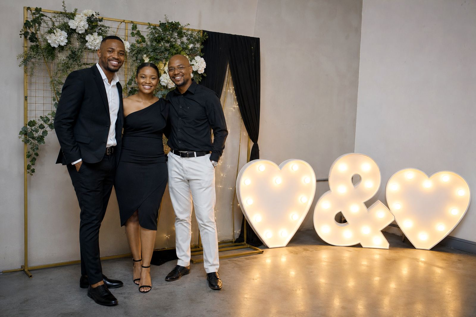
Evening photos depend on what the light does to the frame. A good illuminated sign gives guests something clear to stand beside, but the rest of the area still needs balance. Too much light around the feature can flatten faces and wash out detail. Too little and the letters disappear into the background. The strongest result usually comes from one main sign, a clean backdrop and a little space around the setup.
For weddings, a monogram or names in illuminated letters often works well behind the couple or near the guestbook table. For launches and corporate events, a brand message or slogan in a lightbox suits a media wall, product reveal or registration point. The sign should support the event not fight it.
- Place the sign where guests pause naturally, not where they pass too quickly.
- Leave enough room for photography from different angles.
- Keep nearby decor lower if the sign needs to stay visible across the room.
- Match the sign style to the tone of the event, formal, festive or minimal.
- Use the entrance or foyer when the venue layout splits the crowd.
A well-planned photo area also helps with evening crowd flow. Guests know where to stand, where to queue and where to take pictures without blocking service staff. That matters at busy venues in Sandton, Rosebank and Fourways where the room often fills in stages.
A Midrand event that needed the sign to lead
One Midrand function used a mix of indoor dining and an outside courtyard for photos. The evening started with the room bright and then shifted into warmer, lower light after speeches. The illuminated feature had to work in both settings, so the sign was positioned where guests entered, then kept visible once the music started and people drifted toward the courtyard.
The practical part was straightforward. The power point was checked near the chosen wall, the cable was routed away from the walkway, and the sign was set at a height that stayed readable from the back of the room. Later in the night the same piece still held its place in photographs, without needing to be moved through the crowd.
That sort of setup suits evening events across Johannesburg, Pretoria and Centurion too. The venue may look different, but the pattern stays familiar: place the sign where people gather, keep the cable out of the way, and let the light do the speaking after dark. A careful installation makes the event feel settled instead of improvised.
Choosing between lightboxes, letters and neon-style signs
Different illuminated pieces solve different problems. LED lightboxes suit messages that need to be read cleanly, especially where the wording matters. Marquee letters are stronger when the event needs a bold visual cue, often for initials, initials plus a symbol, or a short phrase. Neon-style signs are useful when the wording is brief and the setting calls for a softer glow.
The right choice often depends on the room size, the backdrop and the amount of ambient light. A small private dinner may only need one glowing feature. A larger corporate launch may need a main sign plus extra lighted letters at the entrance or bar. The key is to avoid crowding the room with too many bright elements, because the strongest evening display usually comes from restraint.
- Use a lightbox when the wording must read clearly from a distance.
- Use marquee letters when the venue needs a bold focal point.
- Use neon-style signage for short phrases, names or event tags.
- Mix formats only when the layout gives each piece enough space.
For Gauteng venues with mixed lighting, the best sign is usually the one that stays legible without extra explanation. That is what guests notice first and what photographers keep returning to through the night.