
Short lines read better under event lighting
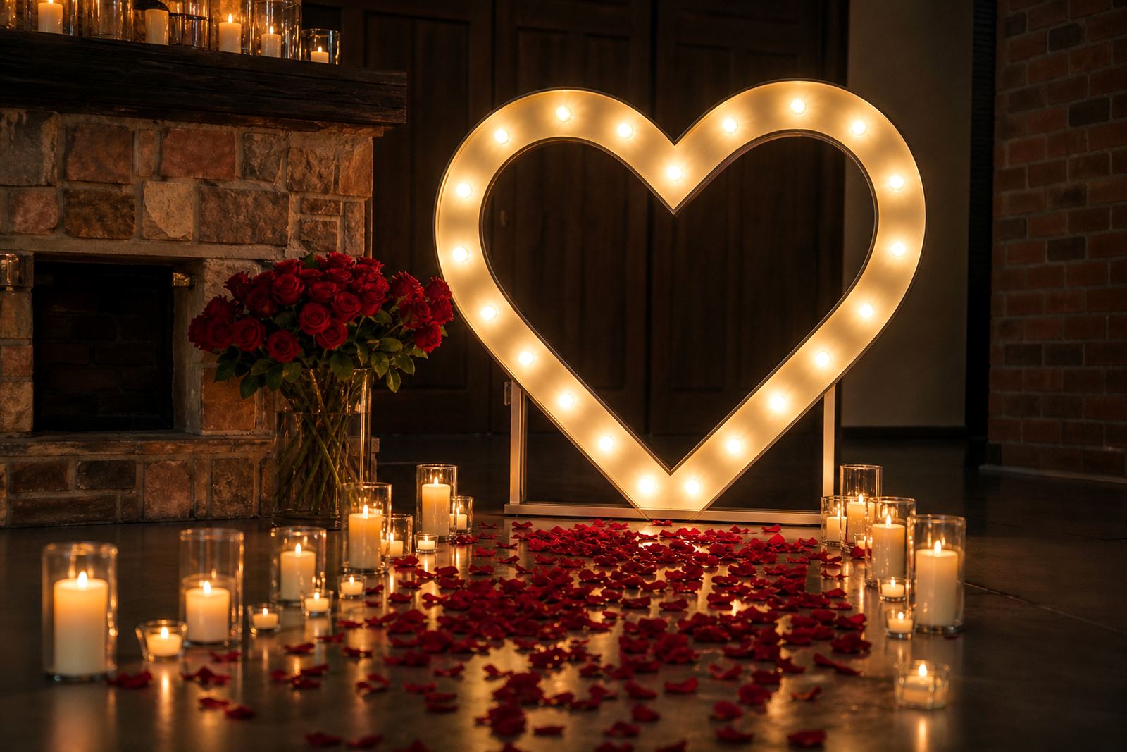
When a sign is lit from inside or outlined with bulbs, every extra word competes for space. A clean line of text is easier to read from across a room, and it also photographs better when the venue lights are dimmed for speeches, dancing or a reveal.
For weddings, parties and corporate events, the strongest wording usually fits into a few words rather than a full sentence. Names, dates, a short welcome, a product label or a simple slogan often does the job well. If the wording is too long, the letters become smaller and the message loses its impact.
- Names and initials work well for entrance features.
- Short phrases suit photo areas and stage backdrops.
- Single words are effective for bars, dessert tables and product displays.
- Long lines can be split across two signs if needed.
Match the wording to the event type
The best wording depends on what the sign must do at the venue. A wedding sign is often warm and personal, while a launch or conference sign needs to feel tidy and direct. In a busy room, guests should understand the message without stopping to read it twice.
For a reception, the wording can be more decorative, especially if the sign sits near flowers or a photo wall. For a corporate function, clear wording is usually better than playful wording, especially where guests are being directed toward a registration table, keynote area or product display.
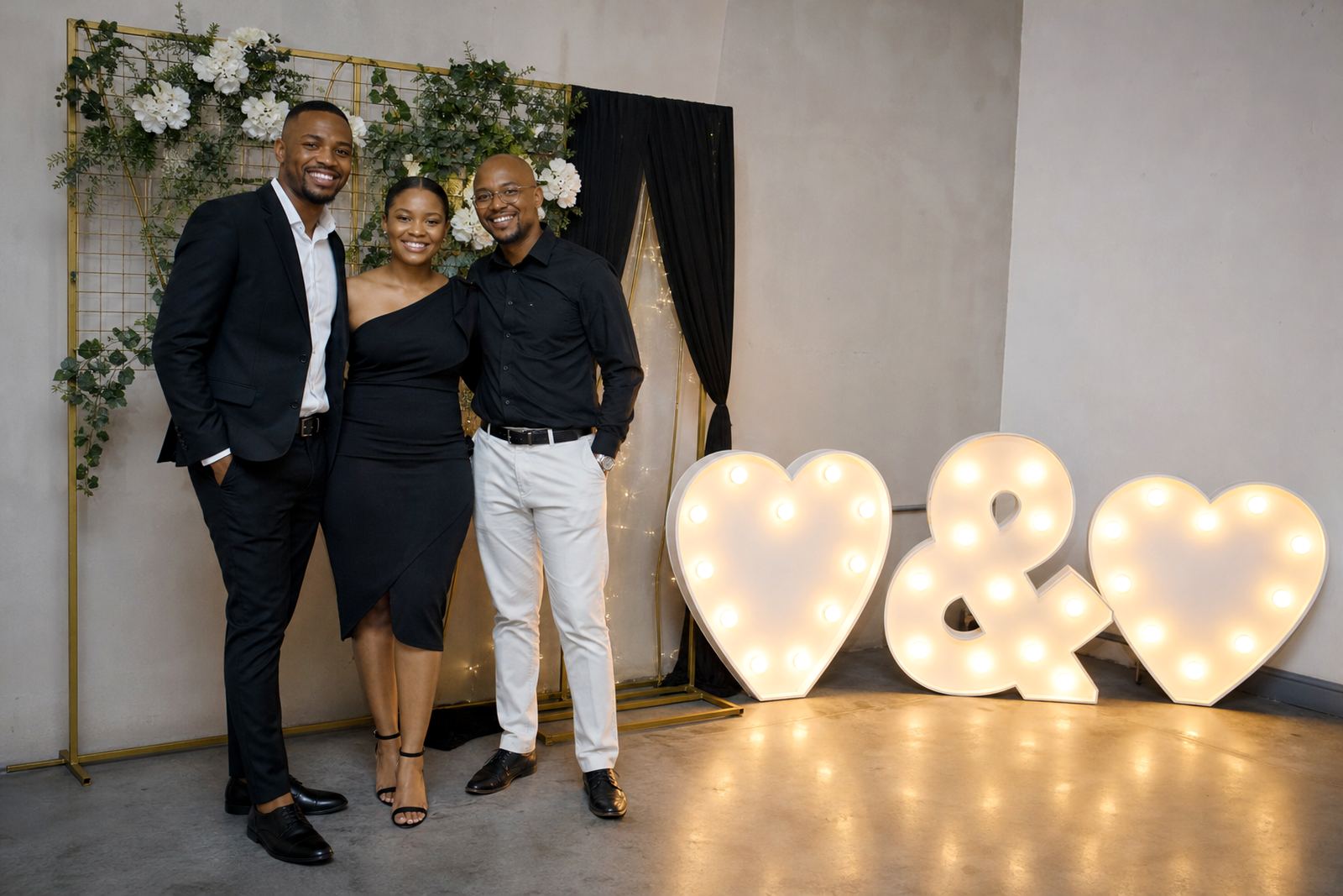
- Weddings: names, dates, welcome words, table zones.
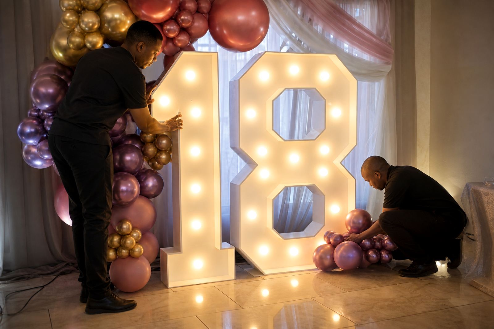
- Parties: birthday names, age numbers, themed phrases.
- Launches: product names, campaign lines, display titles.
- Corporate events: brand names, session labels, photo points.
In Midrand and across Gauteng, many venues have mixed lighting and open floor plans, so wording needs to hold up from several angles. A phrase that looks fine up close can fade into the background if it is too thin or too crowded.
Letter size, spacing and the space around the sign
Wording is only part of the job. The size of each letter, the spacing between words and the space around the sign all affect how well it reads. A compact phrase with good spacing often looks better than a longer line squeezed into a tight frame.
At a venue, a sign needs room to breathe. If it is placed in front of a wall, beside a cake table or near the dance floor, nearby décor should not crowd the message. Safe cable routing also matters, because power points are not always positioned where the sign needs to sit.
- Keep the main phrase large enough for guest viewing distance.
- Leave room for cables without crossing walkways.
- Place the sign where the front face is easy to see.
- Use lighting that does not wash out pale lettering.
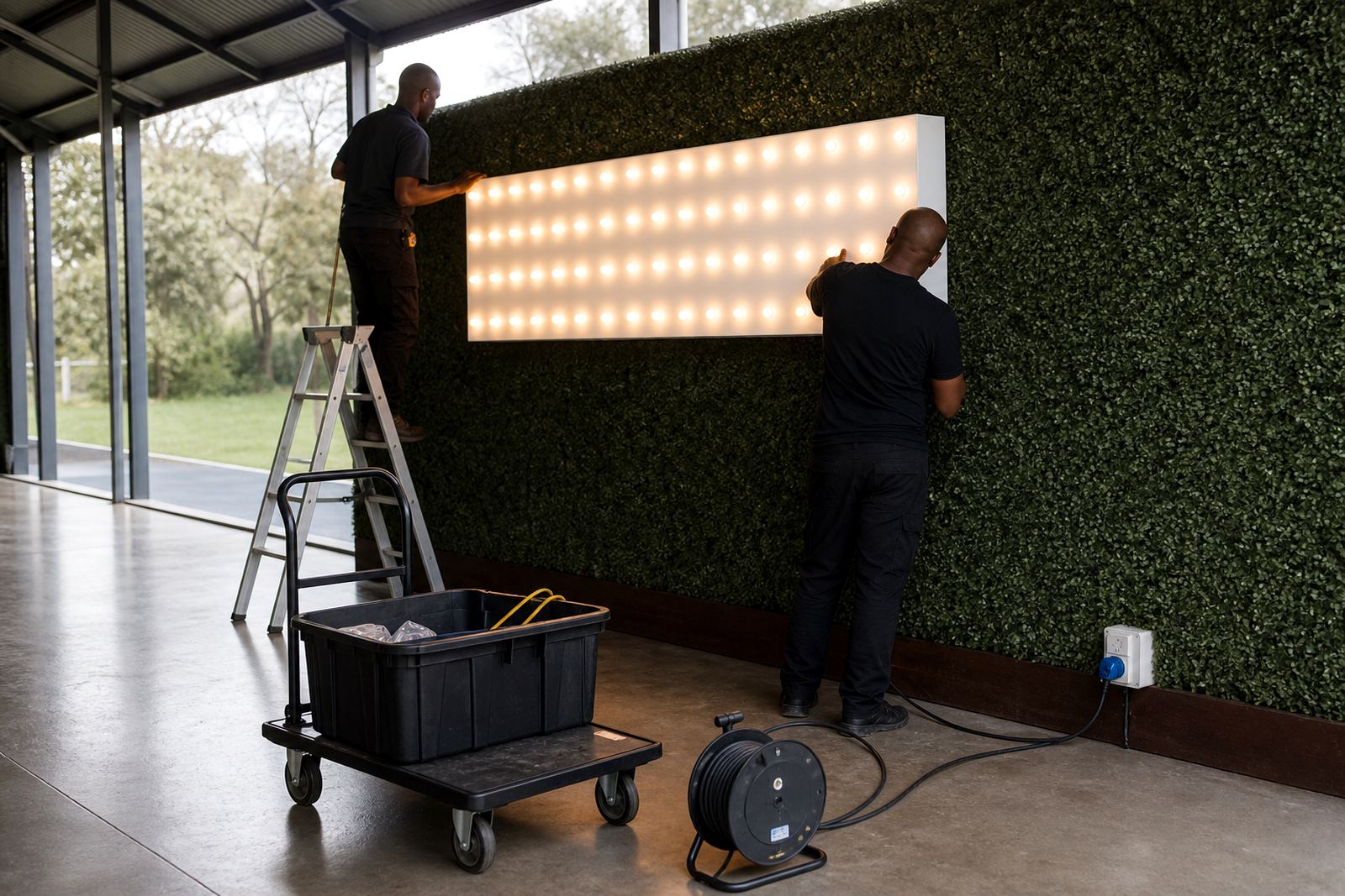
Our team checks the power point, the route for cables and the best position for the sign before set-up begins. That matters at indoor venues and outdoor spaces where the floor layout changes through the day.
Popular wording styles for lightboxes and illuminated letters
Some wording styles are used often because they work across many events. A neat welcome line at the entrance can set the tone, while a single word at the photo area can carry the whole visual moment. The trick is not to overfill the sign with too many ideas at once.
For lightboxes and illuminated letters, the wording usually falls into a few practical groups. Each one needs a different treatment, and the finish should suit the venue and the mood of the event.
- Names and initials for weddings or birthday celebrations.
- Short greetings for entrances and registration points.
- Brand names for launches, media events and staff functions.
- Simple labels for dessert tables, bar areas and photo zones.
- Single statement words for dance floors or feature walls.
A neon-style sign can also carry a short phrase well, as long as the wording is readable from the expected viewing distance. Thin script can look stylish, but it should not be so delicate that it disappears in a bright room.
A Midrand wedding with one clear phrase
At a Midrand wedding, a couple might want the sign to sit behind the cake table and later move near the dance floor. A phrase such as their names, a short welcome, or a simple word like forever can work in both places without cluttering the room. The wording remains easy to read in photos and still feels personal when guests walk past.
That kind of set-up also needs careful handling of power points and cable direction. The sign should not create a trip risk near the aisle or block a server route, and the lightbox should be placed so the front face is level. If the venue has a glossy floor or tight aisle space, the installation plan needs a bit more care than the wording itself.
For out-of-town work to Johannesburg, Pretoria, Sandton, Centurion or Durban, the same principle applies. A strong short phrase travels well because it suits different layouts, different room sizes and different camera angles.
Practical checks before the wording is final
Before a sign is prepared, the wording should be read out loud and checked at the size it will actually appear on the day. A phrase may look fine in a message, then feel crowded once it is fitted into a frame or lit from behind. Spelling, punctuation and line breaks all matter, especially when initials or names are part of the design.
For clients planning a multi-item install, the wording should also match the other features on site. A photo area, marquee letters and a lightbox should not fight each other for attention. When the wording is consistent across the event, the overall look feels ordered and deliberate.
- Keep the message brief so guests can read it at a glance.
- Check spacing between words and initials.
- Match the sign style to the venue and theme.
- Allow space for safe cabling and stable placement.
- Confirm whether the sign sits indoors or outdoors.
Our Midrand team handles delivery, venue set-up, post-event collection and late night collection where required. A contact form booking gives enough detail to plan the wording, placement and equipment list without guesswork.