
Words That Feel Like A Real Proposal
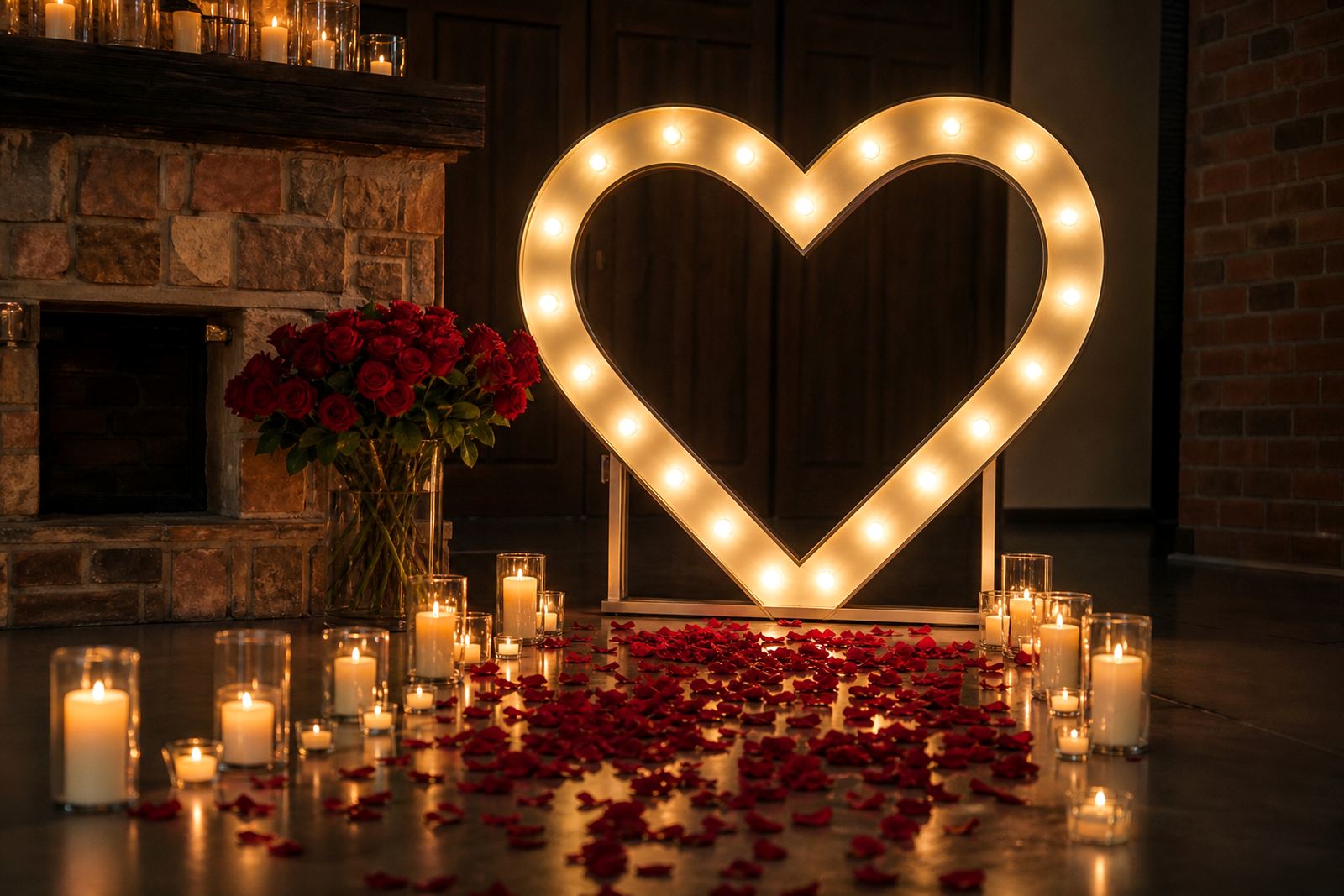
The strongest proposal signs use a short line that sounds natural when spoken out loud. Keep the message direct, warm and easy to read from a few steps away. A couple of words can do the job better than a long sentence, especially when the sign sits among flowers, candles or a photo backdrop.
For a private moment, a plain question often works best. For a larger celebration, the sign can hold a nickname, a date or a line that points guests to the proposal spot. The key is to let the words match the setting. A rooftop dinner in Sandton, a garden setup in Midrand or a beachside dinner in Durban all call for different tones.
- Choose a brief message guests can read easily in dim light.
- Keep the line personal to the couple, not generic.
- Match the message to the venue size and distance.
- Allow breathing room around the sign so the display does not feel cramped.
Which Sign Style Suits The Moment
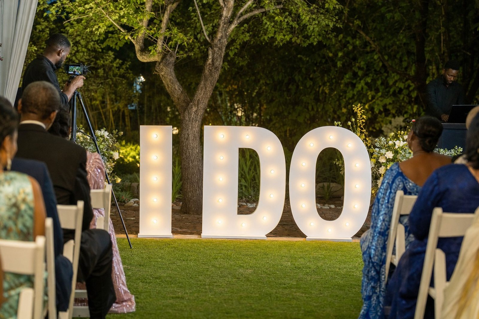
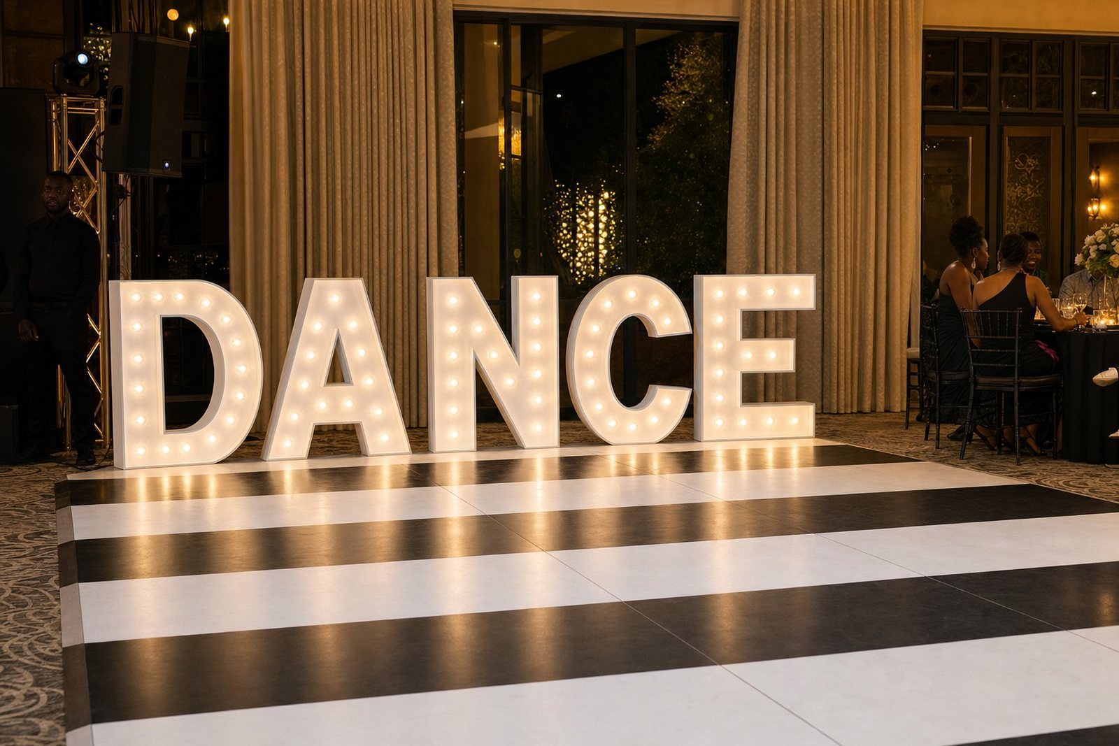
LED lightboxes suit clean, modern wording and work well when you want a flat face with even light across the text. Marquee letters give more height and a softer glow, which can suit a ballroom entrance or an outdoor deck. Neon-style signs add a more playful look and can make a proposal corner feel intimate without needing much extra decor.
For a proposal at a restaurant in Rosebank or a venue in Centurion, the right style often depends on what else is already in the room. If the space has strong feature lighting, a simpler sign can hold its own. If the setting is dark or minimal, the sign may need a bit more presence so it does not disappear into the background.
- Lightboxes work well for crisp text and clean framing.
- Marquee letters suit initials, names or short phrases.
- Neon-style signs work well for romantic lines and dates.
- Choose one main sign rather than packing in too many elements.
Lighting That Flatters The Proposal Shot
Good proposal signage is about the wording and how the light falls across the space. A sign that is too bright can wash out faces, while one that is too dim may lose detail in photos. Soft surrounding light usually helps the sign look clear and keeps the couple visible in the frame.
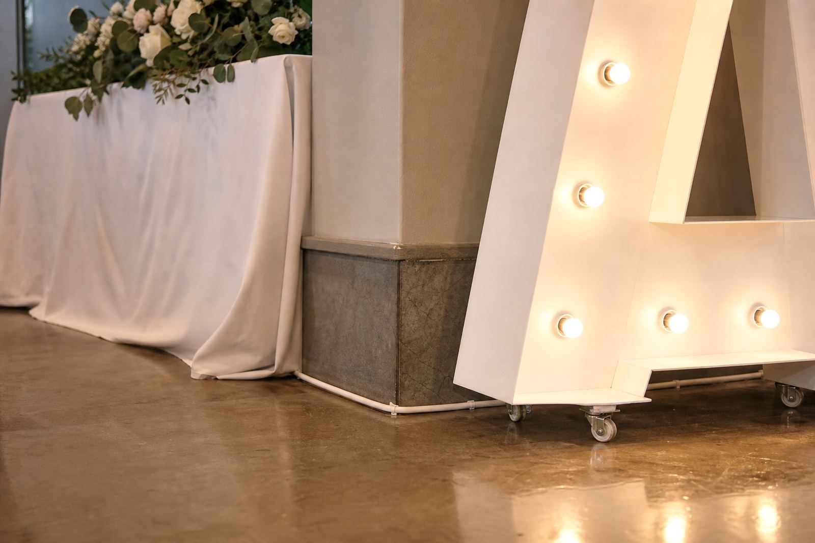
Our team often works with a simple layered layout. The sign sits at eye level or slightly below, while surrounding lights stay gentle and warm. If the proposal is outdoors in Gauteng, especially in an open venue with evening wind or changing weather, placement matters even more. The sign needs a stable base, neat cabling and a position that keeps it visible without blocking the view.
A local setup in Midrand might use a glowing surname with a short proposal line beneath it, set near a floral frame and a small aisle. That keeps the message focused and gives the photographer a clean angle without extra clutter in the shot.
Placement Around The Venue
Where the sign sits changes how the whole proposal feels. Near the entrance, it becomes a reveal. Beside the table, it feels private. At the centre of a photo area, it becomes part of the celebration after the question has been asked. The layout should match the route the couple and guests will actually take through the venue.
At indoor venues in Pretoria or Johannesburg, wall space and power points usually shape the layout. Outdoor venues need more attention to safe cable routing and sheltered positioning. If the ground is uneven or the surface is soft, the installation should be planned with proper support rather than pushed into place at the last moment.
- Keep walkways clear for guests and staff.
- Place the sign where cameras can see it without angles that cut off the text.
- Avoid glare from windows, mirrors or polished floors.
- Use the room shape to guide the layout, not the other way around.
Set-Up Details That Make The Difference
A proposal sign should look effortless to the guests, but it takes careful set-up behind the scenes. Delivery, positioning, power point checks and safe cable routing all matter. A sign that is well placed can still look untidy if cables cross the floor or sit too close to foot traffic.
For corporate proposals or brand-led engagements, the finish matters even more. Clean lines, level placement and tidy edges help the sign read properly in photos and video. The same applies to multi-item installs where a sign sits with flowers, plinths or a small stage. Every item needs enough breathing room, otherwise the display starts to look overworked.
In a practical Midrand set-up, the crew may arrive with the lightbox, test the nearest power point, place the sign so it faces the main camera angle, then route the cables out of sight. That kind of detail keeps the moment calm, and it avoids awkward adjustments when guests are already seated.
A Gauteng Proposal Can Still Feel Local
Proposal signage does not need to feel staged in a heavy way. A clean layout can still feel personal if it reflects the place and the people involved. In Sandton, that might mean a polished indoor finish with subtle flowers and one glowing message. In Durban, the same idea might be used in a warmer, more relaxed setting with an outdoor view and fewer decorative layers.
One Midrand example is a proposal planned around a small dinner setup with a lightbox reading a short question, placed near the end of a walkway. The wording was simple, the route to the table was clear and the sign gave the photographer a strong focal point. That approach works because it lets the moment lead, rather than forcing the decor to do too much.
- Let the venue shape the layout.
- Use wording that sounds like the couple.
- Keep the lighting steady and the setting uncluttered.
- Plan collection after the event so the space is left tidy.
Signs That Still Feel Good In Photos After The Question
Once the question has been asked, the sign often stays in the background of group photos, toast pictures and close-up shots of the ring. That is why the finish matters. Letter spacing, light colour and the surrounding decor all affect how the sign reads after the proposal itself is over. A display that looks neat in person usually holds up better on camera too.
For weddings, parties and corporate events, the best proposal signs are the ones that do not fight for attention. They carry the moment, then settle into the scene. That balance is what makes them useful for a private proposal and for a larger celebration where guests will keep taking pictures long after the first reveal.
When the wording is honest and the setup is tidy, the sign does more than decorate a space. It gives the proposal a clear centre and makes the memory easier to photograph, which is exactly what most couples want on the night.