
Start With The Phrase You Want People To Read First
The strongest neon-style signs are short enough to read in one glance and clear enough to hold up in photos. Names, initials, a single phrase, or a simple welcome line usually work better than a long sentence with several ideas packed together. If the sign sits behind a stage or cake table, the wording should stay readable from across the room and not vanish into a busy backdrop.
Think about the moment the sign will handle. A wedding entrance asks for different wording from a launch wall or a birthday photo area. For a corporate event, keep the text direct and tied to the message the venue needs to carry. A few well chosen words carry more weight than a crowded line with too many joins and flourishes.
- Use names, initials, short phrases or one clear statement
- Keep letter counts sensible for the viewing distance
- Check that the wording reads well in photographs
- Avoid long lines that force the sign to look cramped
Choose A Colour Feel That Matches The Room
The colour of the glow changes the whole mood of the sign. Warm white usually feels softer and suits romantic settings, while pink, blue or amber can push the sign toward a more playful look. Stronger tones stand out well in darker rooms, but in bright daylight they need careful placement so the light does not wash out.
When the venue has warm interior lighting, a cooler sign can create contrast. If the room already has coloured uplighting, the sign should not clash with it. Ask how the colour will sit against linen, flowers, curtains and painted walls. That small check can save you from a sign that looks good on its own but feels off in the room.
- Warm white suits elegant and softer styling
- Pink, blue and amber suit more lively settings
- Match or contrast the room lighting on purpose
- Test the colour against the backdrop, not just on a plain wall
Let The Backdrop Do Its Share Of The Work
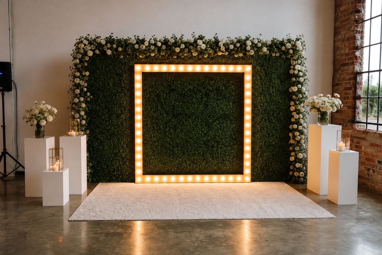
A neon-style sign needs a backdrop that gives it room to breathe. Plain walls, draped fabric, greenery panels and structured frames all work in different ways. The sign should not sit too low, too high, or too close to a busy pattern that steals attention from the lettering. Even a lovely sign can feel lost if the background is too loud.
At venues with mirrors, glass or polished finishes, reflections may affect how the light reads in photographs. Matte surfaces tend to behave better. For outdoor placements, check wind exposure and whether the sign will still read clearly against trees, stonework or the evening sky. A good position is one that looks strong from the entrance, the dance floor and the main camera angle. Sometimes 20 cm either side makes all the diference.
- Use a plain or lightly textured backdrop where possible
- Avoid patterns that compete with the lettering
- Keep camera angles in mind, not just the room layout
- For outdoor use, think about wind and evening visibility
Choose the right sign size and position for the venue
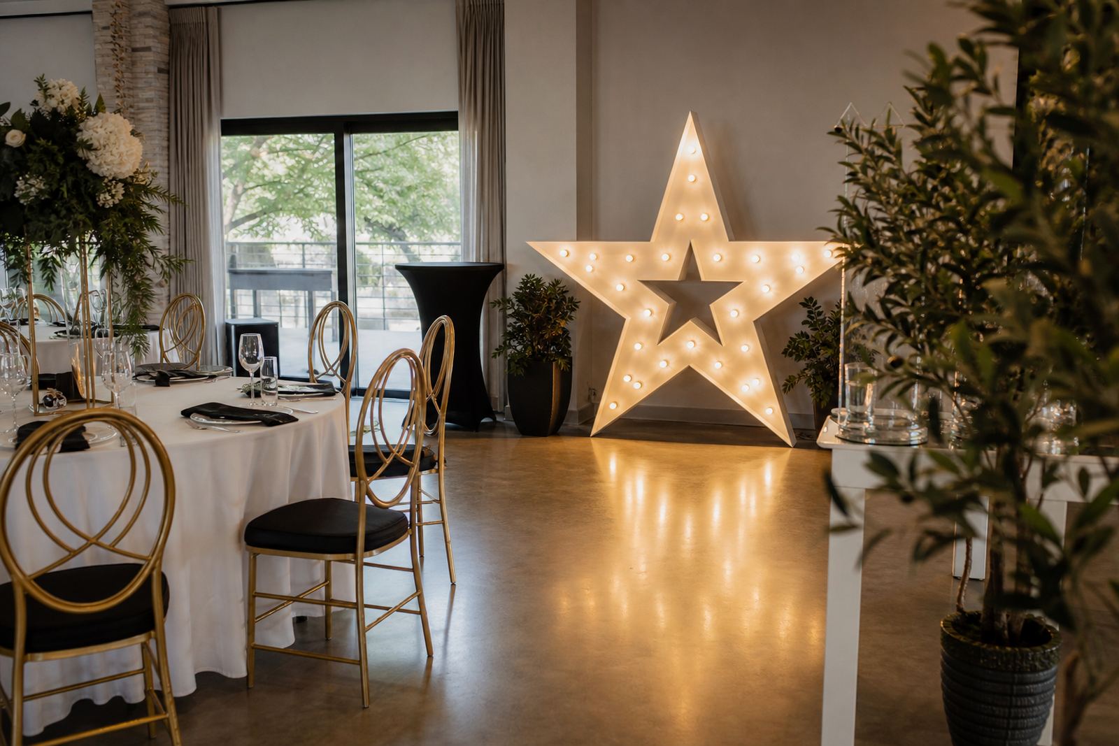
Placement changes how people experience the sign. A small sign can work near a guest table or in a narrow passage, but a grand entrance or main photo wall usually needs more presence. If the sign sits behind a cake table or stage, it should not crowd the props in front of it. Leave enough visual space for the light to read cleanly.
Indoor placement also needs practical clearance around the stand or wall fixings. The sign should not block service paths, draping, or the movement of guests and staff. In larger rooms, a higher mount can help the wording stay visible over heads and floral pieces. For a photo area, think about where guests will stand, where they will turn, and how far the lens will be from the sign.
- Match sign size to the viewing distance
- Leave space for flowers, furniture and photo movement
- Keep walkways clear around the installation
- Lift the sign higher where people gather in front of it
Power Points, Cabling And Safe Set-Up Matter
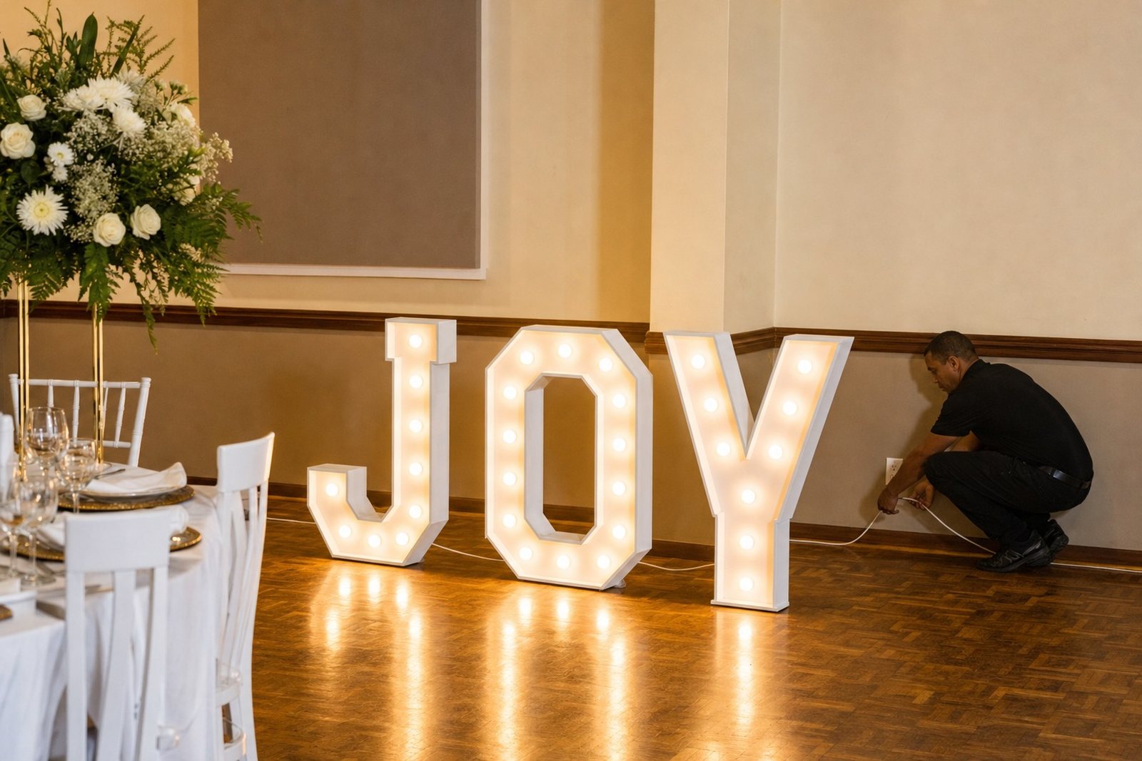
Neon-style signs and illuminated letters need a proper power point nearby and safe cable routing that does not create a trip hazard. On event day, the setup should be neat, the lead lengths sensible, and the cables tucked away from guest movement. If the sign is used outdoors, the placement must suit the venue rules and the available power point position.
A clean install is not only about appearance, it helps the sign stay stable through the event. Extension leads should not be stretched across open walkways or left loose behind furniture. For indoor and outdoor use, the power source, the sign position and the cable path all need to work together. That part is boring until it is not, and then it matters fast.
- Check that a suitable power point is available
- Keep leads away from walking routes
- Use neat cable runs behind backdrops or furniture
- Follow the venue’s placement rules for indoor or outdoor setups
A Useful Checklist Before You Lock In The Look
Before the booking is confirmed, work through the sign as a full picture rather than just a word on a page. The wording should suit the event, the colour should suit the room, and the backdrop should give the light space to do its job. That three-part check usually sorts out most problems before they show up at setup time.
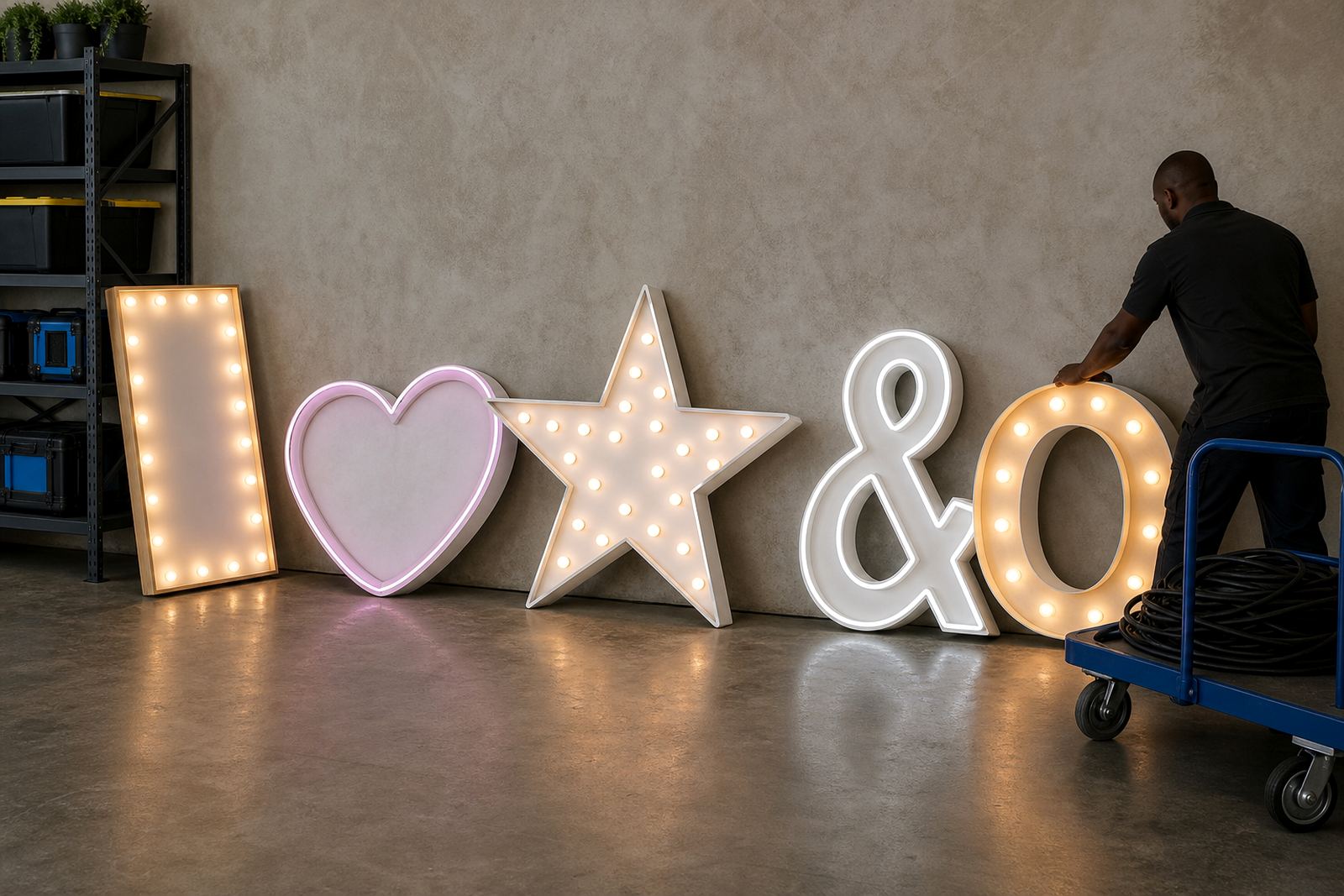
A useful planning list also assists with delivery and collection timing. When the sign sits with marquee letters or other lit elements, the order of placement really matters. The crew may need to load in, set the backdrop, position the lightbox, arrange the cables and then finish the setup in place. Planning the sequence early avoids awkward reshuffling later.
- Choose wording that reads easily and stays brief and clear.
- Colour suits the room lighting and theme
- Backdrop and placement support the sign, not distract from it
- Power point and cable route have been checked in advance
When The Sign Needs To Work In Photos Too
Many neon-style signs are chosen because they look good on camera, so photo use should shape the final decision. The glow must read well without washing out the people standing in front of it. A sign that is too dim will disappear, while one that is too bright can flatten faces and details. The sweet spot is a balanced glow that frames the moment instead of overpowering it.
If the sign is part of a photo area layout, place it where guests can stand naturally without blocking the text. The background should give the shot a tidy edge, with no cable clutter or awkward empty corners. When the wording, colour and placement line up, the sign carries the scene with very little fuss.
- Check how the sign reads in flash and low light
- Keep people and props clear of the main text line
- Hide cables and support points from the camera view
- Make sure the glow frames faces rather than competing with them