
Start with the sight line from the back row
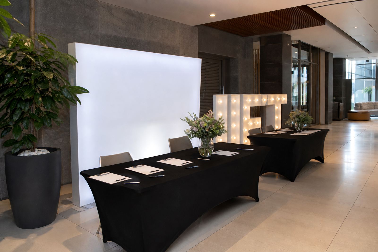
Before a sign goes onto the stage, stand where the furthest guests will sit and check what they see above the lectern, beside the backdrop and across the centre line. A sign that looks perfect from the first row can disappear behind a microphone stand or get cut off by floral pieces when viewed from the back. In Midrand venues with raised platforms and tighter banqueting rooms, that sight line check saves a lot of shifting on the day.
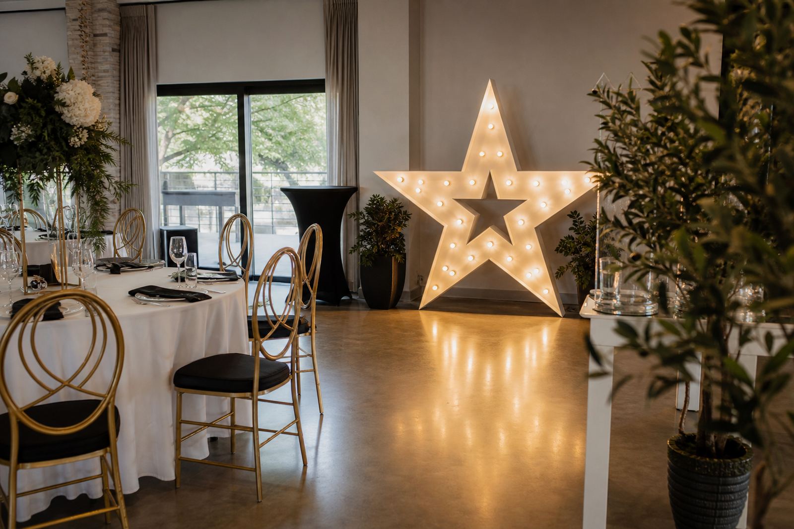
Use the room depth as your first guide. If the stage is shallow, keep the sign higher and flatter against the backdrop. If the room is wide, a longer illuminated word works better than a tall stack that forces guests to turn their heads. Our aim is clear reading, with enough space around the letters so the message does not clash with the décor.
- Check the sign from the back row and side tables.
- Keep important words clear of microphones, stands and drape folds.
- Leave open space around the sign so it does not merge into the backdrop.
- Use a layout that suits the room width before adding extra pieces.
Place the lectern sign where speakers can work naturally
A lectern area needs more than good looks. The speaker should step in, read notes and move a hand without bumping the sign or pulling a cable. For ceremonies, launches and corporate presentations, the best position is usually just off centre or slightly above eye level, depending on the height of the lectern and the backdrop behind it. That keeps the face visible and the sign in shot for photos.
Keep the illuminated piece far enough from the mic stand to avoid shadowing the speaker. If the sign sits too low, the lectern blocks the lower letters. If it sits too high, it can overpower the person speaking. A balanced setup lets the message sit in the frame while the speaker stays the main point of attention.
- Set the sign just off the lectern centreline when space is tight.
- Match the sign height to the lectern and backdrop proportions.
- Leave room for hands, notes and a microphone cable.
- Check that the speaker's face stays visible in photos and video.
Build around the backdrop, not in front of it
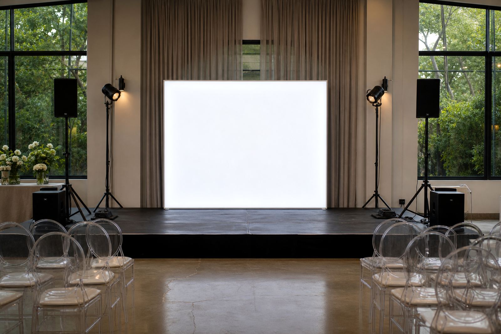
Backdrop signs work best when they sit within the stage set, with a lightbox or word sign placed into the design, not parked in front. A lightbox or illuminated word can sit on the floor against a panel, hang from a support frame, or stand on a plinth if the design calls for it. The right choice depends on the material behind it and how much of the backdrop needs to remain visible. On layered floral walls, for example, a sign that sits too close can flatten the texture and hide the detail.
When the backdrop has strong colour or pattern, choose a sign position that gives contrast without crowding the scene. White or warm illuminated lettering usually reads well against darker panels, while brighter backdrops may need more spacing around the edges. The sign should frame the message, not cut through the design line.
- Keep the sign clear of seams, folds and support poles.
- Allow the backdrop texture to show around the edges.
- Use contrast to help the wording stand out.
- Keep the sign aligned with the main camera angle where possible.
Protect the audience view from every table and aisle
A stage sign must read well for guests seated off to the sides as well as those facing front. If the room has long banquet rows or angled tables, centre the main wording so it does not disappear behind décor at the edge of the stage. In larger Johannesburg and Pretoria function rooms, side visibility is as important as the front view, especially when the sign also appears in event photographs.
For aisle-facing rooms, keep the lower section of the sign clear of tall floral pieces, podium bases and speaker boxes. Anything that sits in the sight path can break the message into fragments. A neat line of sight gives the room a cleaner feel and helps guests follow the stage without strain.
- Test the view from corner tables and side aisles.
- Keep tall décor away from the main reading line.
- Centre the wording so it reads evenly from left and right.
- Avoid placing bright signs where they glare directly into seating.
Sort the power point check before the room is dressed
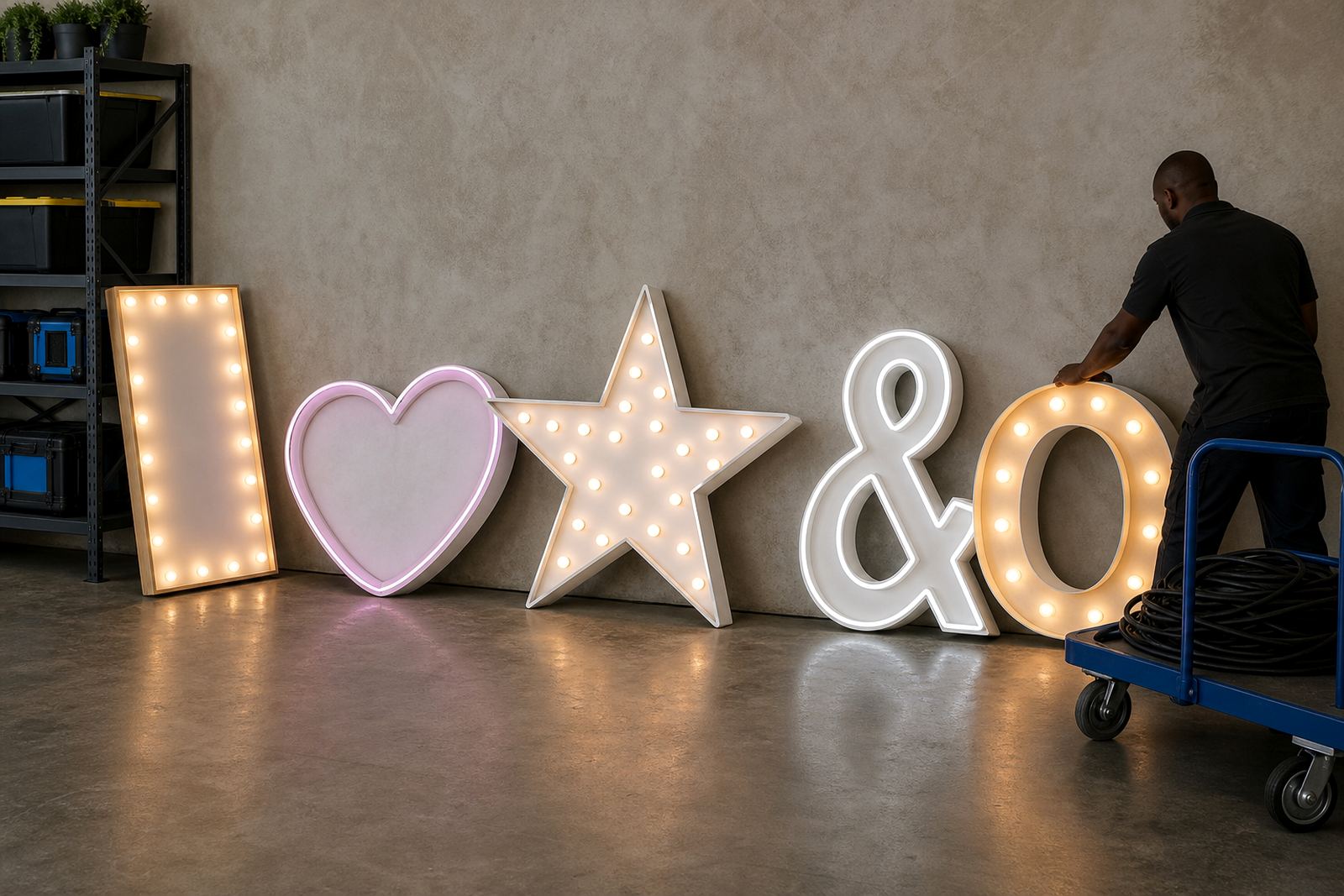
Illuminated signs need a proper power point check before the stage is finalised. The cable route should be planned early so plugs, tape and joins do not show in front of the room. A clean run to the nearest venue power point keeps the floor safe and keeps the stage looking ordered. Where the sign sits outdoors or in an exposed entrance, weather protection and dry routing matter even more.
Safe cable routing is not only about appearance. It reduces trip hazards for staff, guests and speakers moving near the lectern. Keep cables close to walls, under drape lines or behind stage furniture where possible, and avoid loose loops in open walkways. If the event uses several illuminated items, map the power points before fitting the signs so each piece lands where it belongs.
- Check the nearest venue power point before placing the sign.
- Route cables along edges, not across walkways.
- Use secure tape or coverings where the cable crosses a usable area.
- Keep joins out of photo areas and speaker paths.
A final room walk before guests enter
Once the signs are in place, walk the stage from the entry door, the side aisle and the main seating area. Look for reflections, blocked letters, visible cable runs and any point where the sign pulls focus away from the speaker. If the room has a curved layout or a narrow front section, small position changes can make a clear difference.
For weddings and launches, final checks also help with photos. A sign that reads well in person should also hold its shape in camera frames. That means level placement, tidy spacing and no clutter at the base. A short room walk catches details that are easy to miss when the stage is still empty.
- View the sign from the entry, the centre and both sides.
- Look for glare, shadows and blocked lettering.
- Check that the base stays neat in pictures.
- Adjust the angle if the sign does not read cleanly.