
Short words carry better in bright rooms
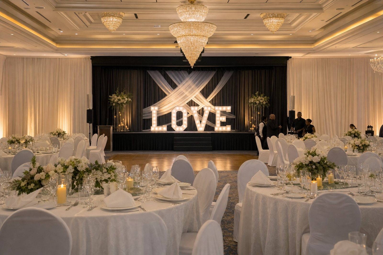
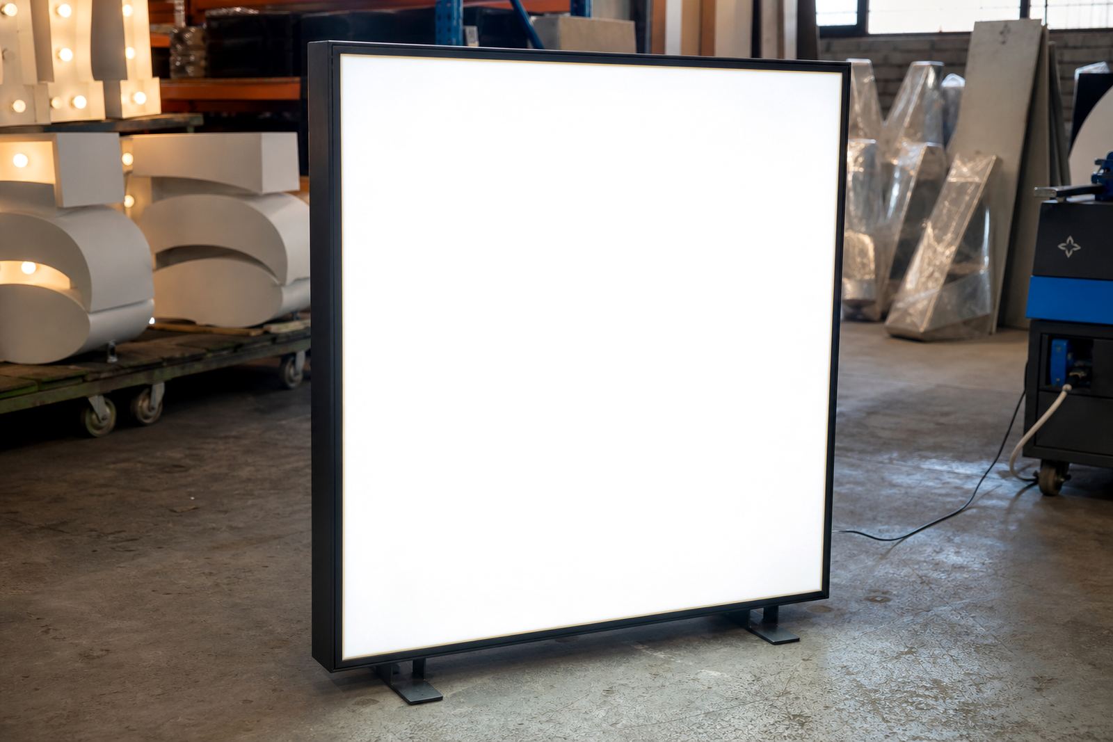
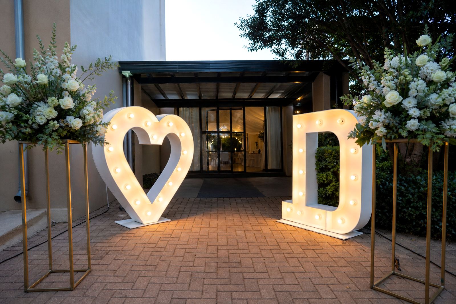
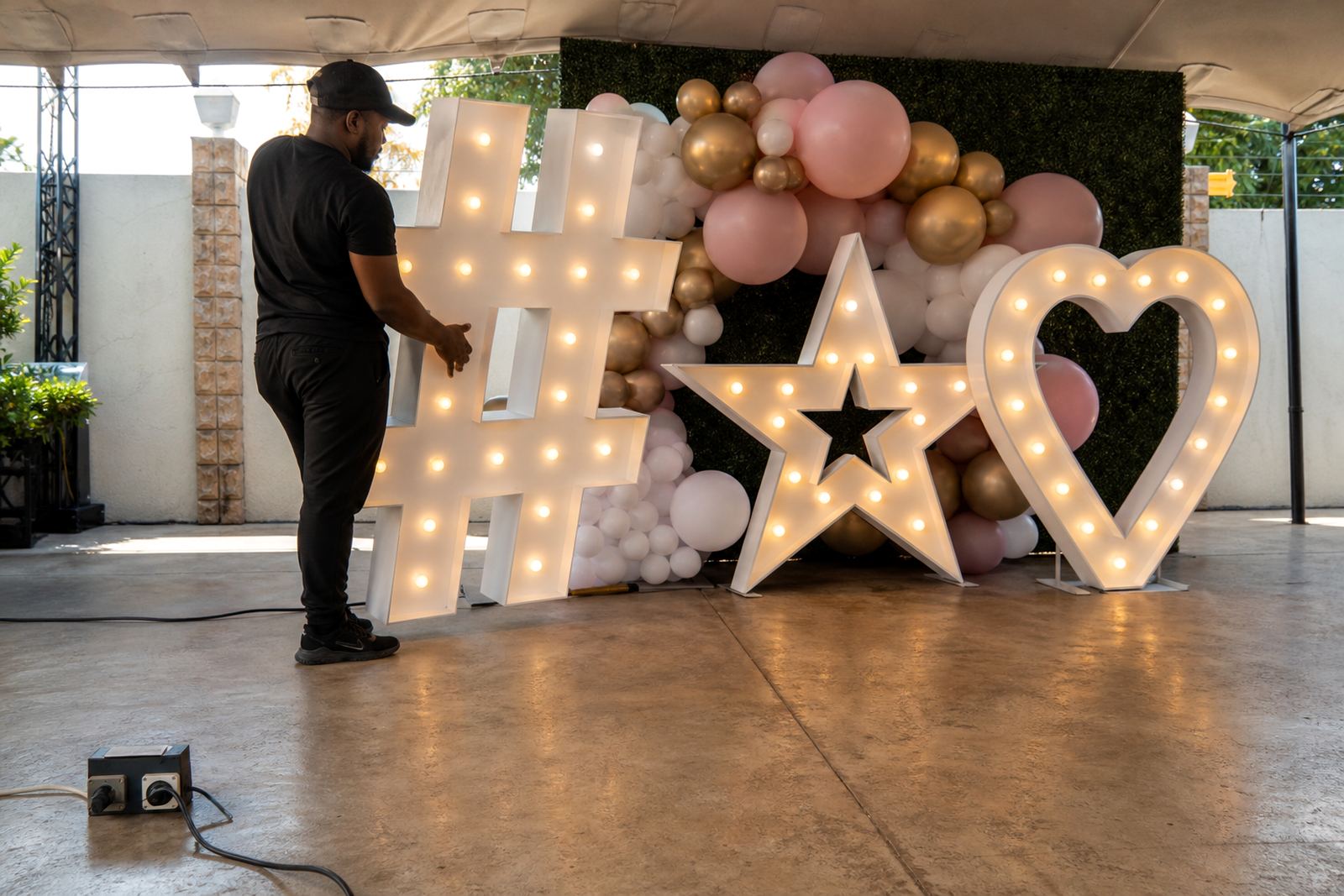
LED lightboxes and illuminated letters are built to be seen at a glance. That is why party wording does better when it stays short and clean. A crowded sentence can look neat on paper but feel heavy once it is cut into letters, fitted into a box or spaced across a wall. Short wording also photographs better when guests are moving past the sign or holding drinks near the frame.
In a banquet hall in Midrand or a marquee in Centurion, the sign has to read from a distance and still make sense in the moment. Simple words give the light time to do its work, and the lettering does not fight for attention with table décor or floral pieces.
Words that suit weddings, birthdays and launches
The mood of the event should shape the wording you choose. A wedding sign can be gentle and romantic, while a birthday party can be louder and more playful. Corporate launches often need a cleaner line that fits the brand tone without sounding stiff. The format matters too, because a neon-style sign, a marquee word or a boxed phrase each carries a slightly different feel.
- Weddings: Mr and Mrs, Better Together, Love Wins, Just Married
- Birthdays: One More Year, Thirty and Thriving, Born to Celebrate, Party Time
- Launches: Now Open, Welcome In, New Chapter, Celebrate the Reveal
- Dance floors: Let’s Go, Dance All Night, Good Times Only, Keep It Bright
These are short enough to sit well in lit lettering and easy enough for guests to read from across a venue floor.
How the venue changes the wording choice
The room often decides how much text belongs on the sign. A small indoor venue near Rosebank may need just two or three words because the viewing distance is tight. A larger reception space in Sandton can handle a longer phrase, but the sign still needs breathing room around it. Outdoor placements call for wording that stays clear when seen against daylight, trees or busy décor.
For Durban functions, the humidity and evening air can affect how fixtures sit, so the wording should be supported by a layout that keeps the sign legible and stable. That means choosing letters with enough spacing, then matching the phrase to the size of the frame or freestanding setup.
- Shorter phrases suit cocktail areas and entrance points
- Medium phrases work well behind the cake table or bar
- Very long wording is better broken into separate sign elements
Dance-floor lines that do not overwork the room
Dance-floor signs do not need to carry a full message. They need energy. A few strong words can shift the whole mood without crowding the space. If the dance floor already has moving lights, floral clusters or a photo backdrop, the wording should stay lean so the eye gets one clear point of focus.
Good dance-floor wording often uses rhythm and repetition in a small space. A sign that says Let’s Dance feels direct. A phrase like Tonight We Celebrate gives a bit more occasion without becoming long-winded. If the letters are illuminated, the glow adds the mood, so the text itself can stay plain. That works well at venues where guests move between dining and dancing through the evening.
- Use action words when the dance floor needs more energy
- Keep the phrase readable from the edge of the room
- Keep clear room around the sign so the floor still feels open.
Midrand party signs with clear wording
For a birthday in Midrand, a client may want a lightbox near the entrance and illuminated letters beside the dance floor. In that case, the wording can carry two jobs at once. The entrance sign might say Welcome to the Party, while the dance-floor piece says Good Times Only. Both are short enough to fit the event flow, and each one gives guests a quick cue about where they are in the venue.
That kind of layout also helps the setup team plan power point checks and safe cable routing without making the room look busy. When the wording is concise, the physical install can stay neat and the signs can be placed where they matter most, not squeezed into corners just to fit a longer sentence.
Practical wording checks before the letters are made
Before a phrase is fixed for production, it helps to read it out loud and picture it on the sign itself. A line that sounds fine in a text message may not sit well in large illuminated letters. Long words can break awkwardly, while short words often hold shape more neatly across the frame. Capital letters, spacing and punctuation also change how the piece looks once lit.
A useful way to test wording is to ask three questions: can guests read it from across the room, does it suit the type of event, and will it still look balanced beside the rest of the décor. If the answer is yes, the sign usually does its job without needing extra language.
- Check the phrase against the sign size, not just the invite wording
- Keep brand language separate from the party message when needed
- Use one strong line rather than several small lines